

Harlow Canada - real estate website design for a Toronto-led brokerage
Harlow Canada is a real estate brokerage across 22 Canadian markets, from Vancouver Island to Halifax.
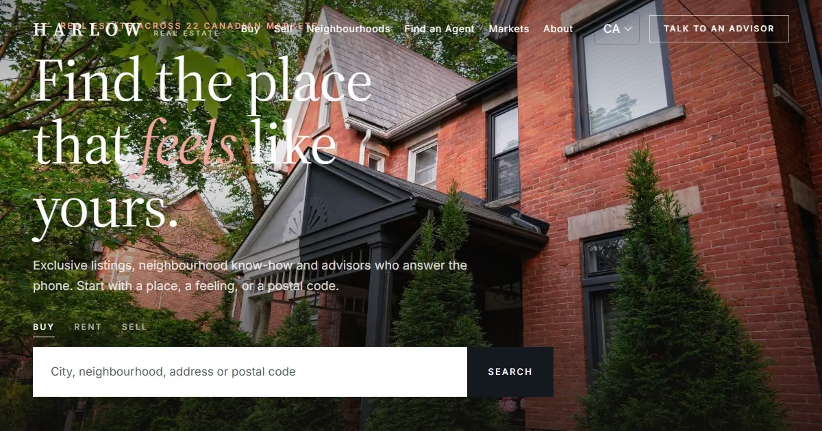
Harlow Canada is a real estate brokerage across 22 Canadian markets, from Vancouver Island to Halifax. It builds on the US edition, as Canadian English does, then changes what matters: Canadian spelling (colour, neighbourhood, but -ize), provinces and postal codes, CAD, PIPEDA and CASL, and provincial human rights codes.
Project facts
- Client: Harlow Real Estate Inc., Brokerage (fictional)
- Sector: Residential real estate brokerage
- Markets: Toronto plus 21 markets in seven provinces and one territory
- Services: Market localisation · Copywriting · Brand adaptation · Real estate website design · Accessibility (WCAG 2.2 AA) · SEO foundations
- Templates: 9 page templates shared with every Harlow edition
- Stack: Hand-built HTML, CSS and vanilla JavaScript; one strings file and one theme file per market
The brief
Close to American, but unmistakably Canadian
Canada sits between the US and the UK, so the edition starts from US English and applies Canadian spelling automatically. Then the content changes: Cabbagetown instead of the West Village, TTC lines instead of Midtown commutes, a CASL-compliant consent line for email, and provincial human rights codes, including the receipt of public assistance as a protected ground in housing.

Designing for Canada
What actually changed between the US and this edition
- Story - US edition: 27 US markets · Canada: 22 Canadian markets, founded in Cabbagetown
- Spelling - US edition: color, neighborhood · Canada: colour, neighbourhood (with -ize kept)
- Guide - US edition: West Village · Canada: Cabbagetown, Toronto: Victorian homes, Riverdale Farm, Line 2
- Search - US edition: ZIP · Canada: Postal code
- Markets - US edition: States · Canada: Provinces: Ontario, BC, Quebec, Alberta, Atlantic Canada
- Legal - US edition: Fair Housing, state privacy · Canada: PIPEDA + Quebec Law 25, CASL, provincial human rights codes
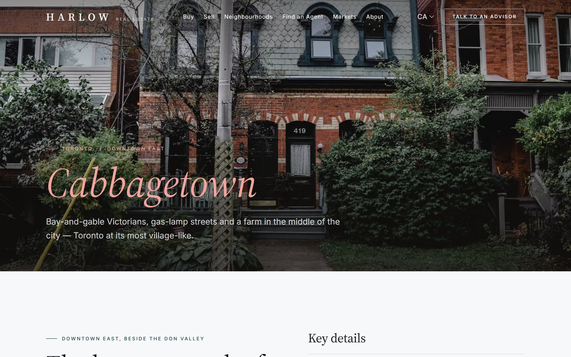
- Look - US edition: Ivory, bronze, Cormorant · Canada: Cool greys, spruce green and one restrained red; Source Serif 4 + Inter
Brand adaptation
The same Harlow, with a local accent
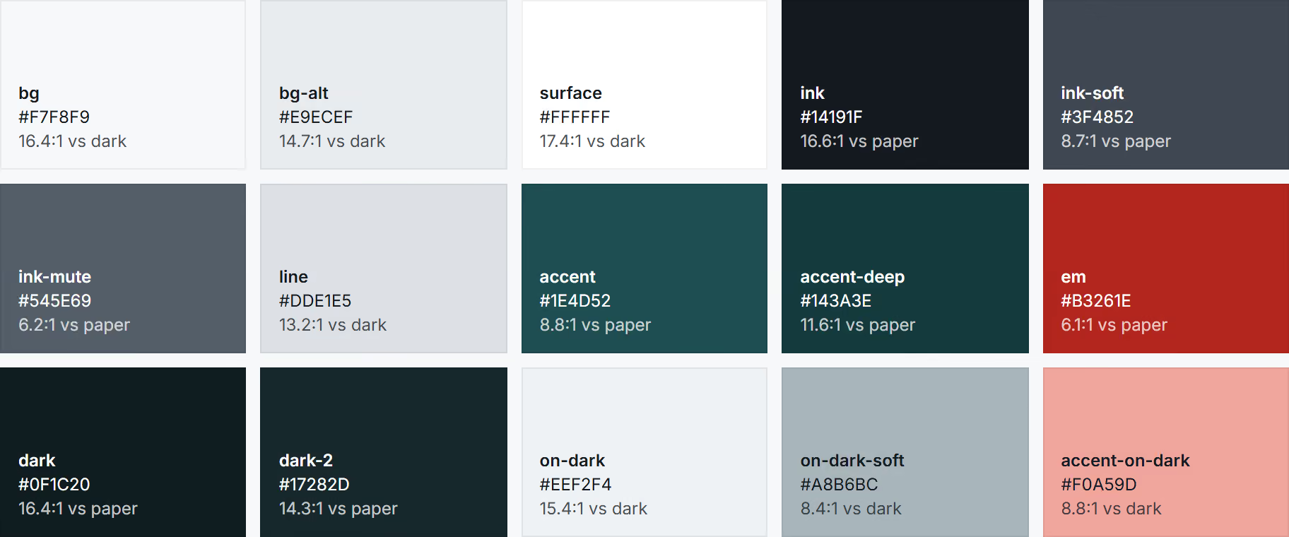
Spruce green carries the interface; a single restrained red is used only for italic emphasis, so the palette reads Canadian without leaning on the flag. Source Serif 4 and Inter give a crisp, civic, highly legible feel. The Real Estate descriptor stays.

Homepage and neighbourhood guide
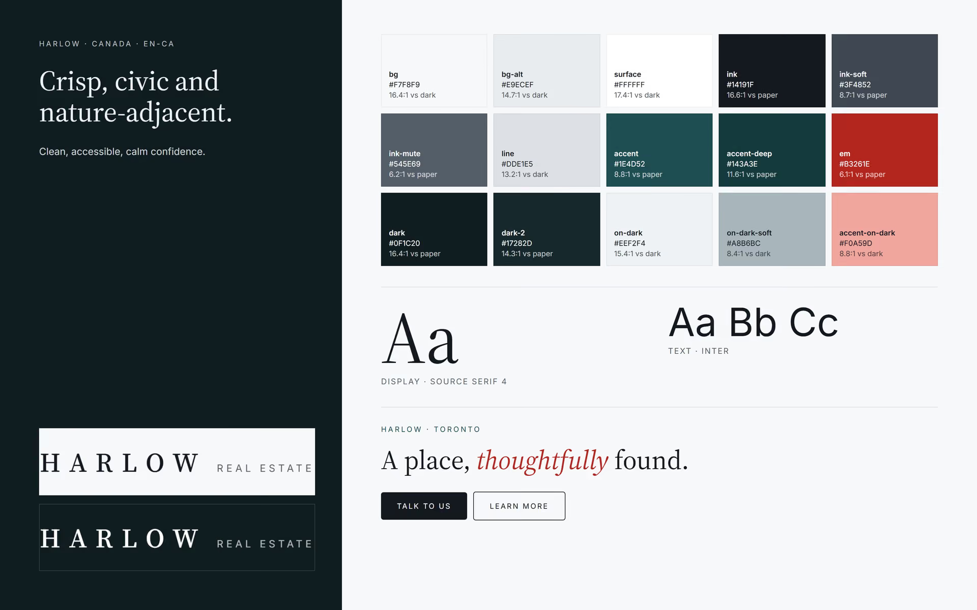
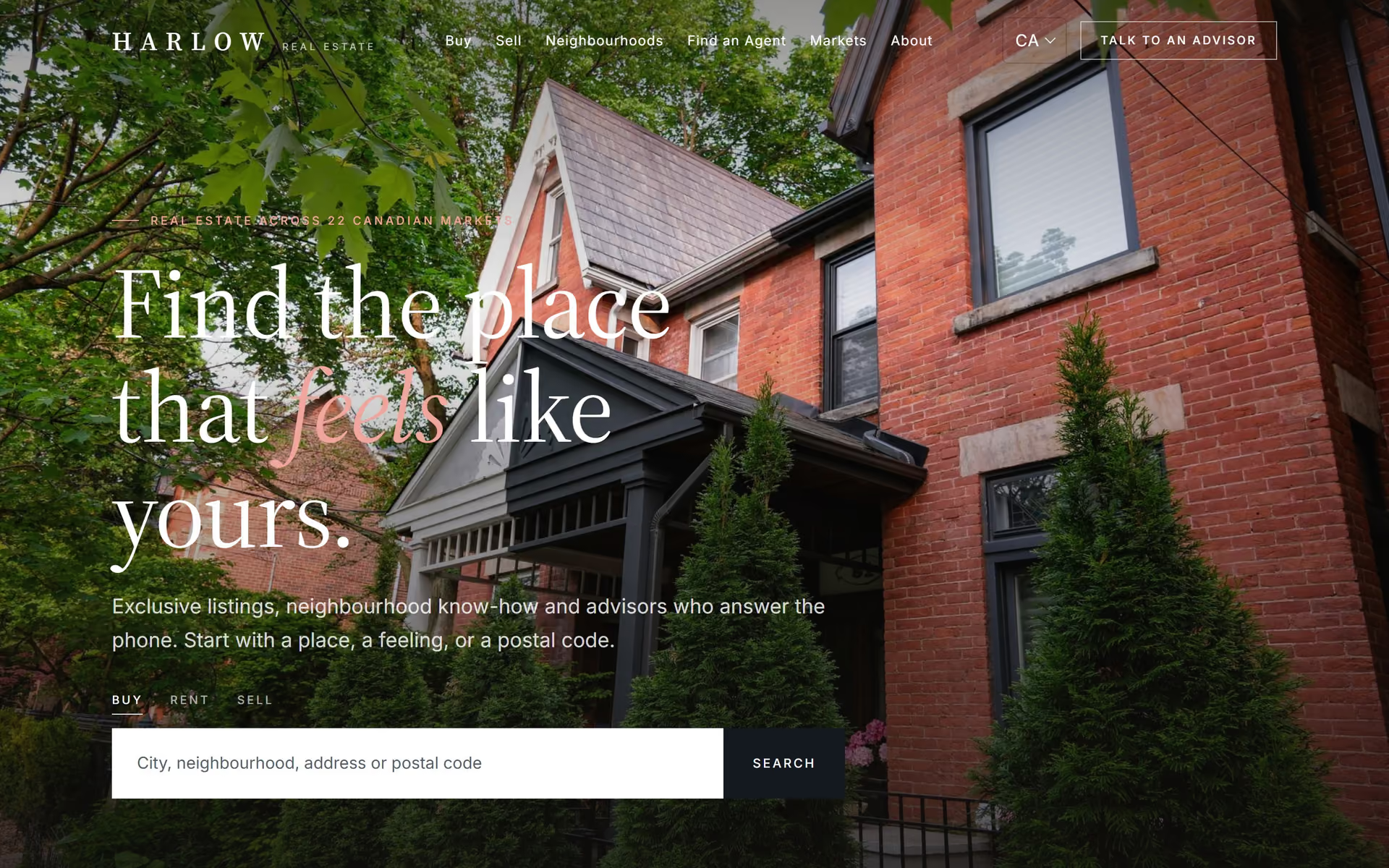
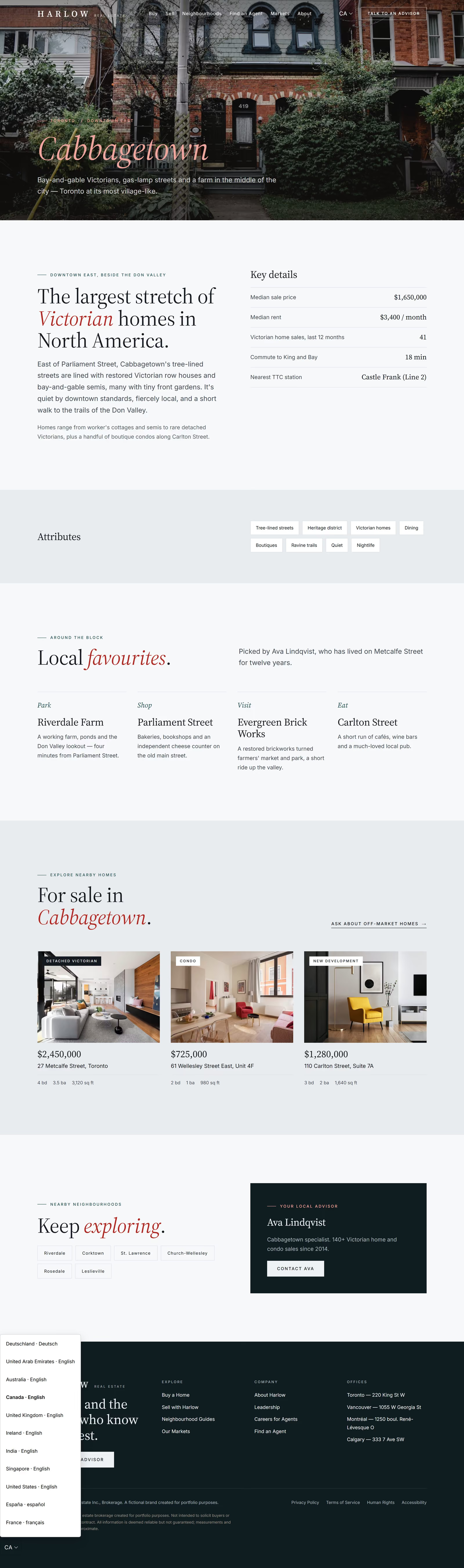
A red-brick Toronto house opens the site; the search asks for a city, neighbourhood, address or postal code. City cards cover Toronto, Vancouver, Montréal, Calgary, Ottawa and Halifax. The Cabbagetown guide quotes median price, monthly rent, Victorian home sales, commute to King and Bay, and Castle Frank station.
Compliance, accessibility and trust
- Privacy policy under PIPEDA, with Quebec Law 25 noted for Quebec residents and the Office of the Privacy Commissioner of Canada as the complaint route.
- Express consent for commercial email, as CASL requires.
- Human rights statement listing provincial protected grounds in housing, including receipt of public assistance.
- Passes automated WCAG 2.2 AA checks on every page at 360, 390, 768 and 1440 px: no contrast failures, no unreachable controls, no horizontal scrolling.
- A language switcher built from
hreflangsits in the header on desktop and in the footer on phones.
One system, twelve markets
Every visible string lives in one file per market, and every colour and typeface in one theme file. This edition needed no new templates or components: a strings file, a theme, regional photography and local legal content made it a different brand experience. For a property group with international plans, a new market becomes a content project rather than a rebuild.
Deliverables
- Market profile: language, formats, legal and seasonality
- Full localised copy across 9 templates, header, footer and forms
- Brand adaptation: palette, type pairing and logo descriptor
- 21 regional photographs (Pexels, credited in
credits.json) - Local legal content
- Accessibility pass (WCAG 2.2 AA, automated) and QA at four screen widths
- Portfolio media: stills, full-page captures, scroll video, OG image, brand board
FAQ
How is a Canadian real estate website different from a US one?
Canadian spelling, provinces and postal codes, CAD pricing, PIPEDA and CASL compliance, and provincial human rights codes instead of US Fair Housing.
Should a Canadian site be bilingual?
Federal and Quebec audiences expect French. The Harlow system is ready for a fr-CA edition alongside this one.