

Harlow UK - estate agent website design for a London-led property brand
Harlow is a fictional estate agency group with offices across 31 UK markets, from Mayfair to the Cotswolds. We took the brokerage we designed for the US and rebuilt it for Britain.
Harlow is a fictional estate agency group with offices across 31 UK markets, from Mayfair to the Cotswolds. We took the brokerage we designed for the US and rebuilt it for Britain. That meant a new London-first story, British property language, regional photography, a heritage colour and type system, and UK legal pages. All of it runs on the same design system, so the UK edition shares every template with its US and German sisters.
Project facts
- Client: Harlow Property Ltd (fictional, portfolio concept)
- Sector: Prime & residential estate agency
- Markets: London plus 30 UK markets across England, Scotland and Wales
- Services: Market localisation · UK copywriting · Brand adaptation · Estate agent website design · Accessibility (WCAG 2.2 AA) · SEO foundations
- Templates: 9 page templates shared with the US and German editions
- Stack: Hand-built HTML, CSS and vanilla JavaScript; one strings file and one theme file per market
The brief
An estate agency website that sounds and looks British, not a US site with pounds signs
Most "international" property sites are a find-and-replace job: dollars become pounds, and the rest stays American. Harlow wanted a UK edition that a London buyer would take for a home-grown agency. It needed the right vocabulary (flat, let, freehold, pcm, estate agent), the right places, and a look that felt at home on Westbourne Grove rather than Madison Avenue.
The three audiences stay the same, but their questions change:
- Buyers and tenants browse by neighbourhood and Tube line, and want off-market homes before they reach the portals.
- Sellers want to know how Harlow markets a home before they book a valuation.
- Advisers are weighing whether to bring their fee income to Harlow.

Designing for the UK
What actually changed between the US and UK editions
- Story - US edition: 27 US markets, founded in Brooklyn · UK edition: 31 UK markets, founded in Notting Hill
- Language - US edition: Realtor, apartment, ZIP, sq ft, 3.5 ba · UK edition: Estate agent, flat, postcode, pcm, 3 bath; British spelling throughout
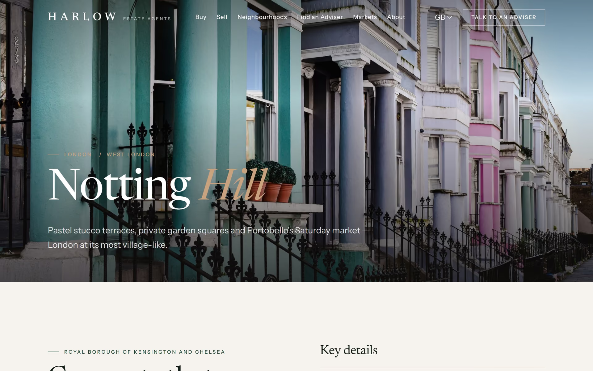
- Neighbourhood guide - US edition: West Village, Manhattan · UK edition: Notting Hill, W11, with garden squares, Portobello Road and the Central line
- City hub - US edition: 49 New York neighborhoods · UK edition: 49 London neighbourhoods, A–Z, filtered by West / North / East London
- Markets - US edition: States and regions · UK edition: Counties and nations: Surrey to Scotland, the Cotswolds to the Lake District
- Prices - US edition: $4,850,000 · UK edition: £4,850,000, £3,950 pcm, budgets in £m
- Legal - US edition: Fair Housing, state privacy rights · UK edition: UK GDPR rights, ICO complaint route, Equality Act 2010, a Ltd company footer
- Consent - US edition: Notice-style banner · UK edition: Opt-in banner with Reject all as prominent as Accept all (PECR)
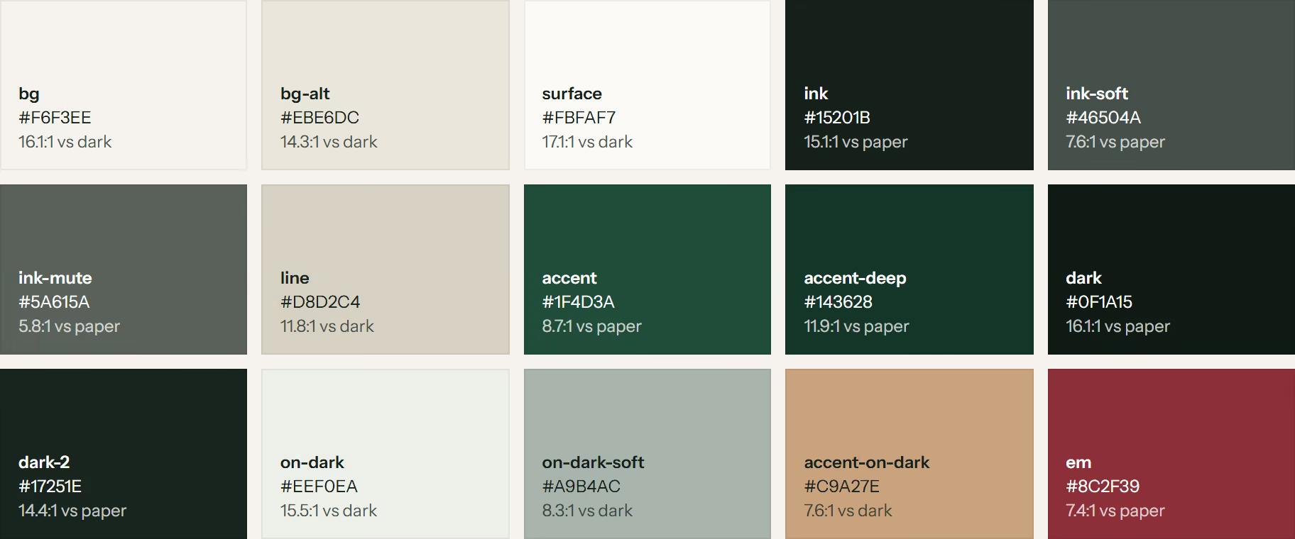
- Look - US edition: Ivory, bronze, Cormorant Garamond · UK edition: Warm stone, racing green and oxblood, Newsreader + Instrument Sans
- Photography - US edition: Manhattan, Miami, LA · UK edition: Stucco terraces, Edinburgh, Oxford, Bath, the Cotswolds
Copy was rewritten, not just respelt. An automated pass handled British spelling, then every page was localised by hand, from the hero line to the small print.
Brand adaptation
The same Harlow, with a British accent
The brand idea doesn't change: a well-run boutique hotel of an estate agency, warm and quietly confident. What changes is the material palette:
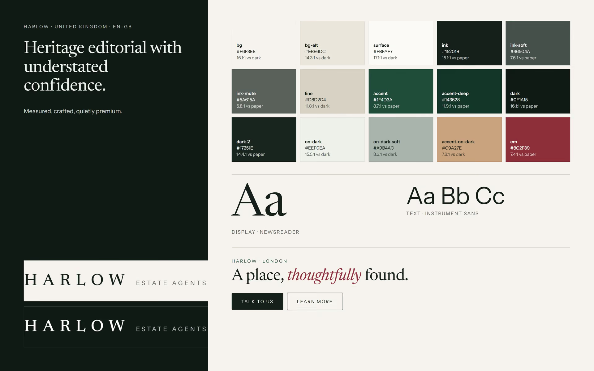
- Colour. Warm stone paper with racing green as the working accent and oxblood for italic emphasis. On dark panels, a soft brass takes over, so every pairing passes WCAG AA.
- Typography. Newsreader, an editorial serif with optical sizes, gives headlines the feel of a quality Sunday supplement. Instrument Sans keeps the interface crisp.
- Wordmark. The tracked HARLOW wordmark is unchanged. The descriptor becomes Estate Agents.
It's all done through design tokens: one theme file sets colour, type and radius, and no template changes.

Homepage
Search first, then a story told in British
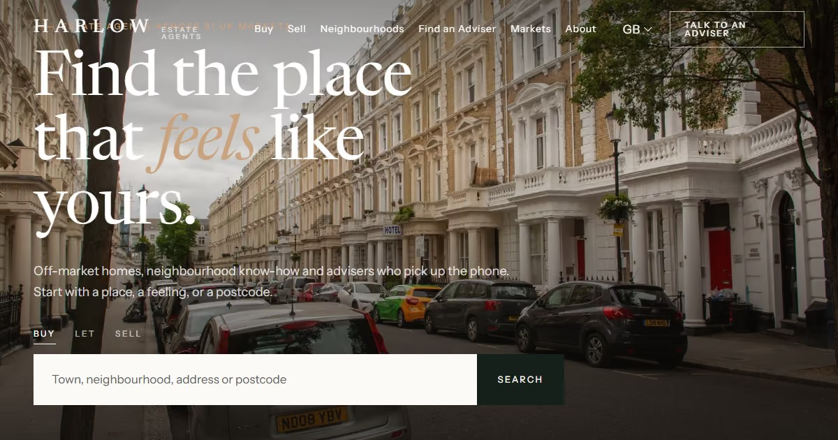
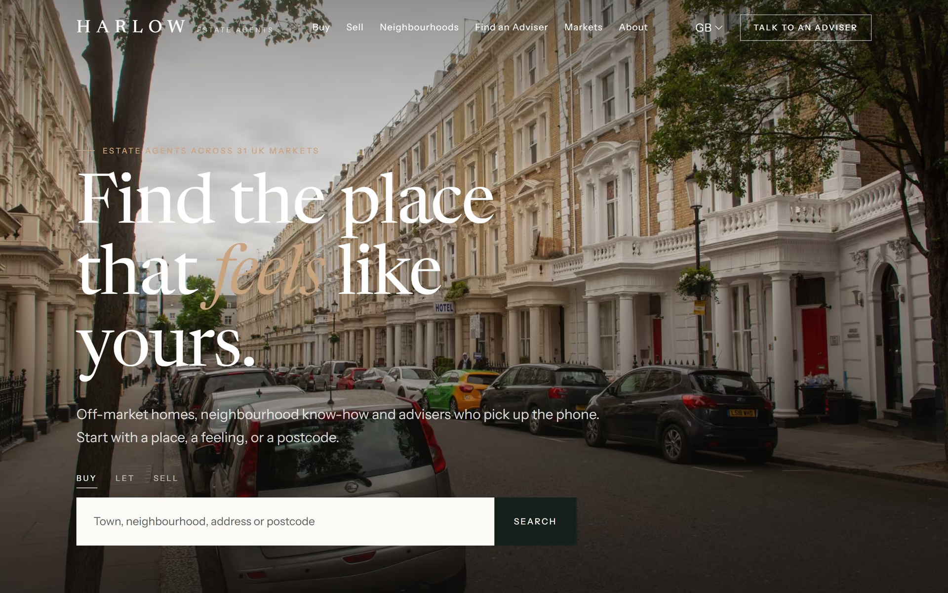
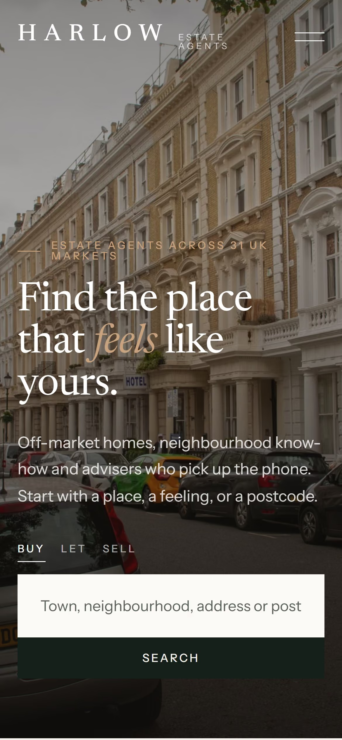
The hero opens on a white stucco terrace with the line Find the place that feels like yours. The search switches between Buy, Let and Sell and asks for a town, neighbourhood, address or postcode. Below it, the proof points are restated for the UK market: £6.2bn in completed sales, 1,150 advisers, 38 offices and 31 markets "from Mayfair to the Cotswolds".
Featured listings move from Miami and Austin to Notting Hill, Edinburgh's New Town and a Cotswold stone house in Burford. City cards cover London, Edinburgh, Oxford, Manchester, Bristol and Bath.
Neighbourhood guides
Local knowledge, written the way Londoners talk about London
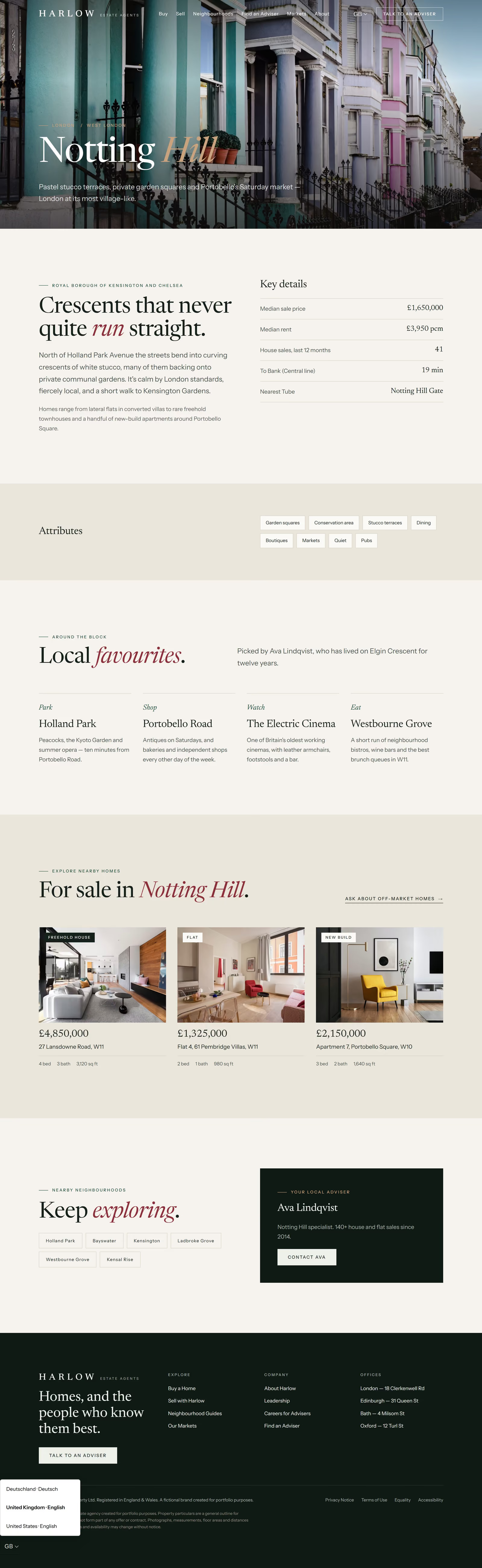
The guide template does its best work in the UK edition. Notting Hill gets an overview of crescents and communal gardens, a key-details table (average price, rent pcm, house sales, time to Bank on the Central line, nearest Tube), attribute tags (garden squares, conservation area, pubs), local favourites picked by a named adviser (Holland Park, Portobello Road, the Electric Cinema, Westbourne Grove), and homes for sale described the way UK agents describe them: freehold house, flat, new build.
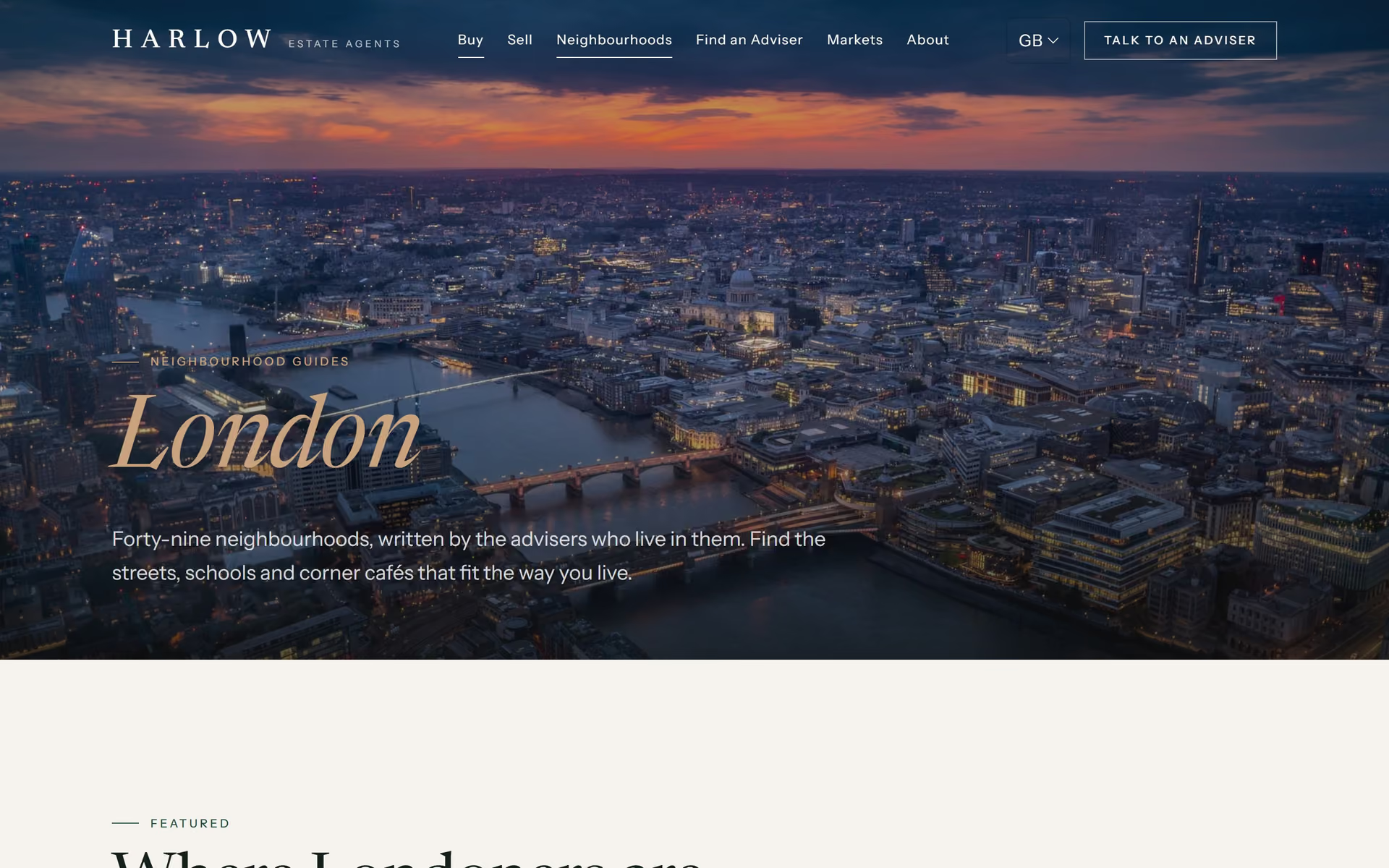
The London hub lists 49 neighbourhoods A–Z and filters featured areas by West, North and East London.
Selling and lead generation
A valuation request that sits where intent is highest
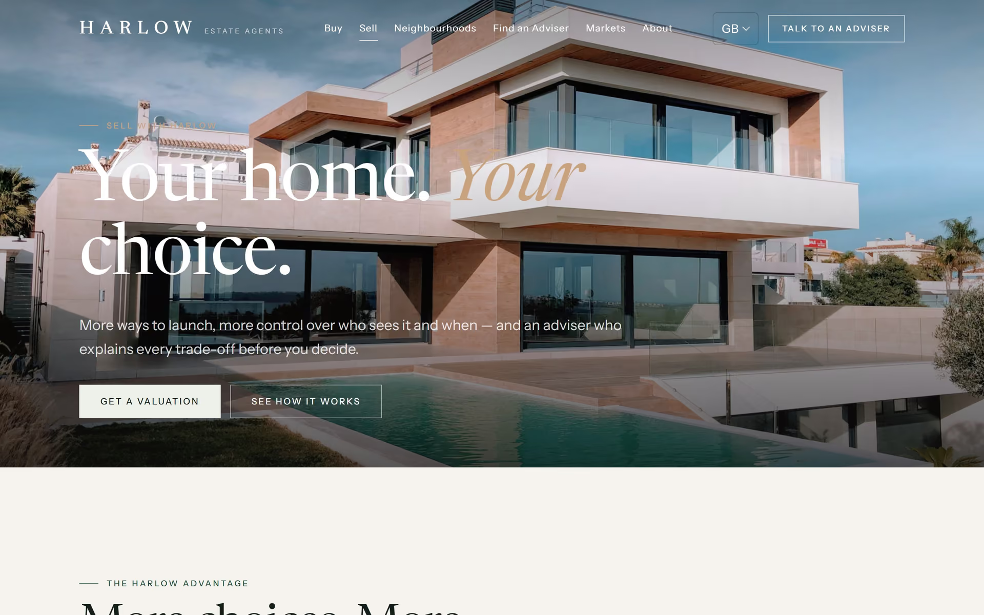
The sell page explains the three-phase launch (Harlow Private → First Look → portal launch) in UK terms: reductions on the record, open days, accompanied viewings, kerb appeal. It then offers a free valuation, usually within 48 hours. Enquiry points stay where the visitor already has a reason to act: after the selling story, beside a local adviser, and inside the adviser-matching service.
Advisers and markets
Directories that read as properly local
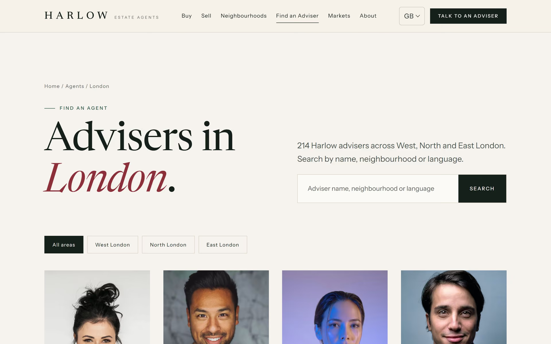
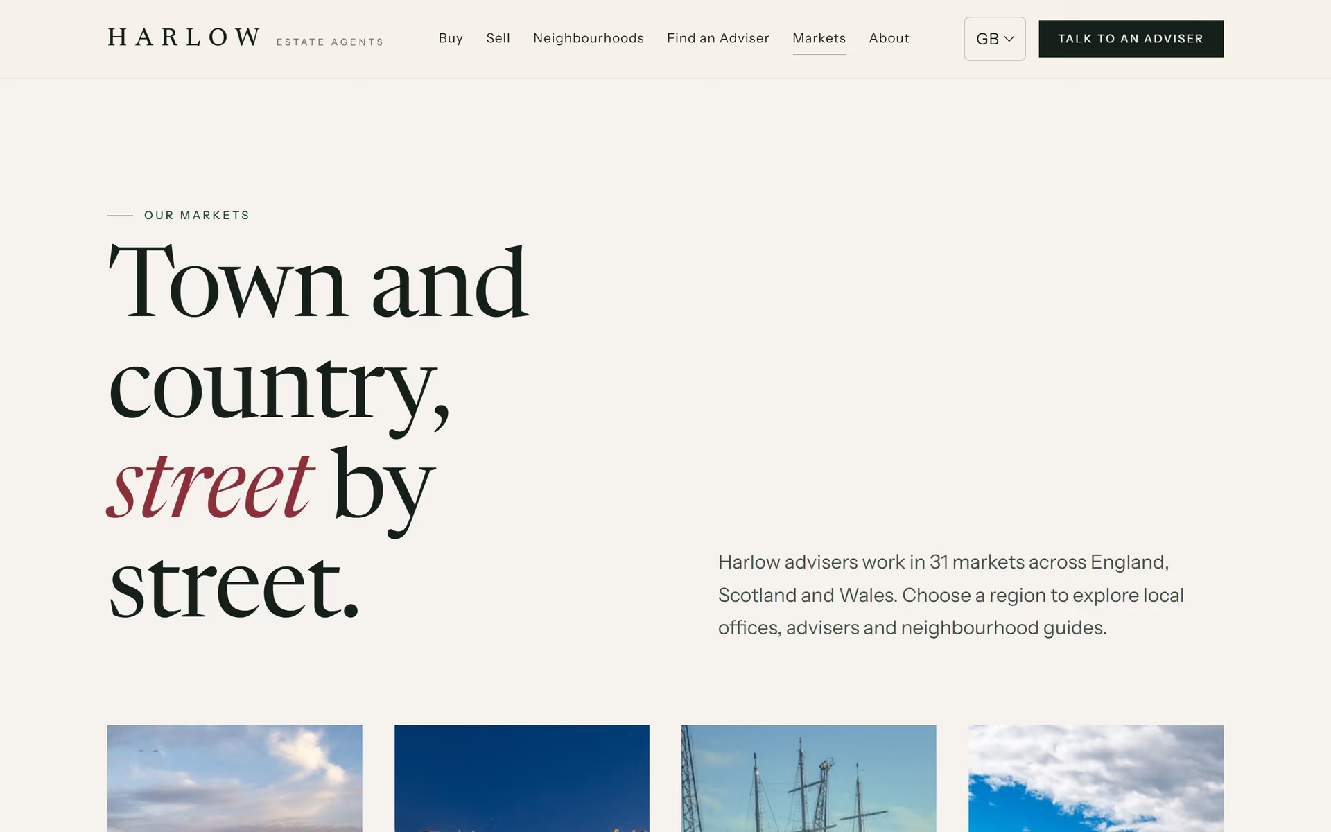
The London adviser directory filters by West, North and East London, and every specialty line names a real neighbourhood and property type (Islington · Georgian terraces, Shoreditch · Warehouse conversions). The markets page reorganises Harlow by county and nation, and the relocation story now runs London to Edinburgh.
Compliance, accessibility and trust
UK rules built into the design system, not bolted on
- Cookie consent. The banner is opt-in, as PECR expects, with Reject all given equal weight. It comes from a shared 5 KB component that switches model by market.
- Privacy. A Privacy Notice sets out UK GDPR rights and the route to complain to the ICO, and names Harlow Property Ltd as data controller.
- Equality. The US Fair Housing section becomes an Equality Act 2010 statement.
- Accessibility. The UK edition passes automated WCAG 2.2 AA checks on every page at 360, 390, 768 and 1440 px, with no contrast failures, no unreachable controls and no horizontal scrolling.
- Language switcher. A switcher built from
hreflangsits in the header on desktop and in the footer on mobile, so search engines and visitors both find the right edition.
One system, three markets
Why the localisation was fast, and why that matters to clients
Every visible string lives in one file per market, and every colour and typeface lives in one theme file. The UK edition needed no new templates and no new components. A strings file, a theme, 24 regional photographs and the legal content made it a different brand experience. For a property group planning international offices, that turns a new market into a content project rather than a rebuild.
brand/ (UK board) alongside the US and German boards in ../../germany-de/media-assets/brand/
Mobile
Designed for the phone in your pocket on the Central line
On small screens the header keeps the logo and menu button, and the language switcher moves to the footer. The search stacks, grids fall into a single column, and the hero overlay deepens so text stays readable over any photograph.

Deliverables
- UK market profile: language, spelling, formats, legal and seasonality
- Full UK copy across 9 templates, plus header, footer and form microcopy
- Brand adaptation: palette, type pairing and logo descriptor
- 24 regional photographs (Pexels, credited in
credits.json) - UK legal content: privacy notice, terms of use, equality statement
- Accessibility pass (WCAG 2.2 AA, automated) and QA at four screen widths
- Portfolio media: stills, full-page captures, scroll video, OG image, brand board
FAQ
What should an estate agent website include in the UK?
Property search by postcode and neighbourhood, featured and off-market listings, local area guides, an adviser directory, a valuation request, a recruitment page, and UK-specific legal pages: a privacy notice under UK GDPR, cookie consent, terms and an equality statement.
How is a UK property website different from a US real estate site?
The language changes (flat, let, freehold, pcm, estate agent), and so do the formats (£, postcodes, British dates). Buyers search by neighbourhood and transport links rather than school districts, and the law expects opt-in cookie consent and clear data rights.
Can one website design serve several countries?
Yes, if brand tokens and copy are kept apart from the templates. Harlow runs US, UK and German editions from one set of templates, each with its own palette, typography, photography and legal wording.
How do you make a luxury estate agency website feel premium?
With generous space, editorial typography, restrained colour, strong photography and slow, deliberate motion. In the UK it also means understatement: fewer superlatives, fewer pop-ups and more local detail.