

Harlow: luxury real estate website design for a multi-market brokerage
A concept residential brokerage across 27 US markets. We designed its brand, information architecture, design system and a responsive website, with neighborhood guides, agent directories and slow, deliberate motion.
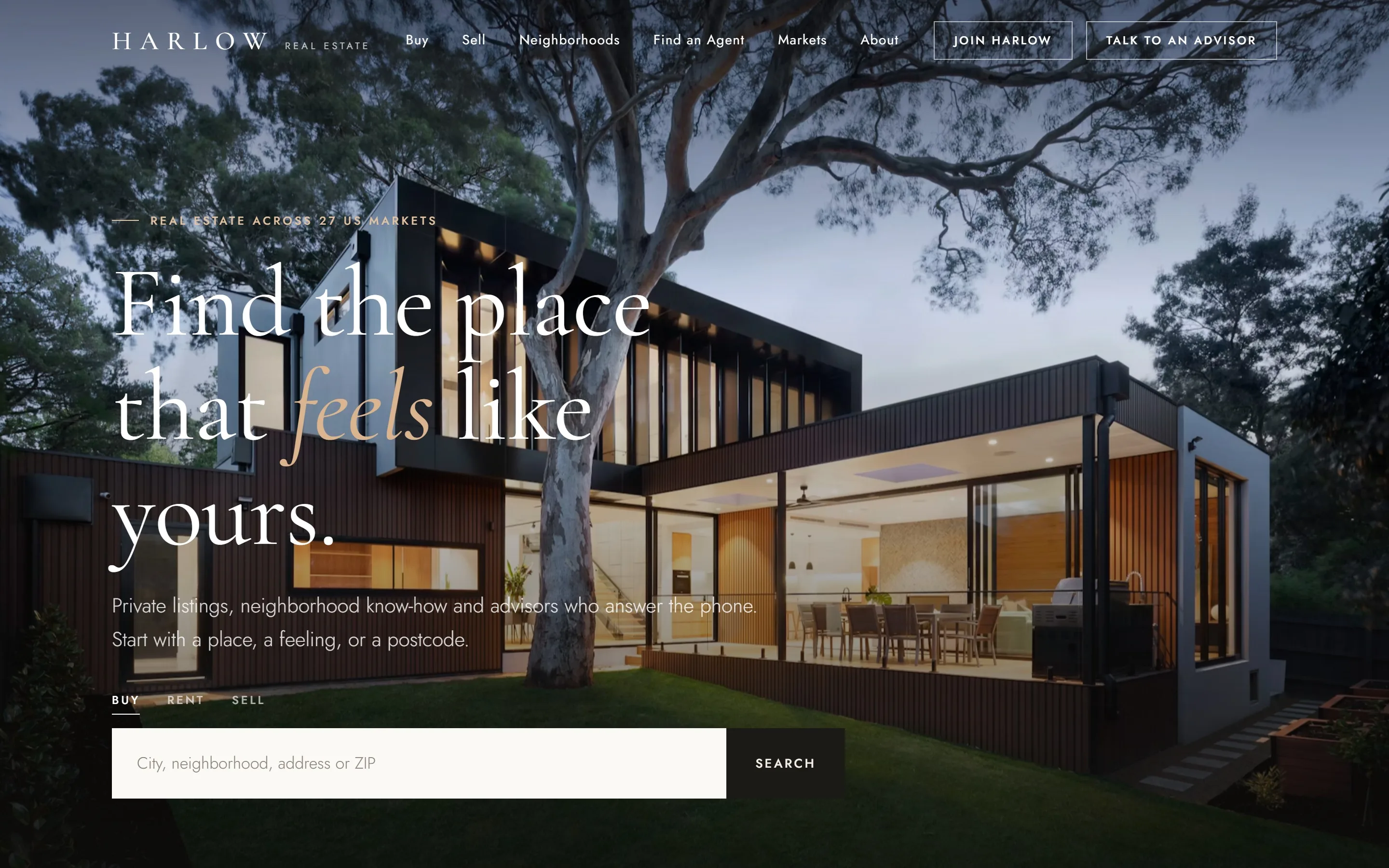
Harlow is a concept residential brokerage working across 27 US markets, made to show how we approach real estate website design. A multi-market brokerage needs a website as considered as the homes it sells. As a real estate web design agency, we built Harlow’s brand identity, information architecture, design system and a fully responsive site: a calm, editorial home for buyers, sellers and the advisors who serve them.
Project facts
- Type - self-initiated concept. Harlow, its listings, agents and figures are sample content.
- Sector - luxury and residential real estate brokerage (a residential real estate brokerage and luxury real estate brokerage in one)
- Markets - 27 US markets, built for international rollout
- Services - UX audit, information architecture, brand identity, real estate website design, design system, front-end development, SEO foundations
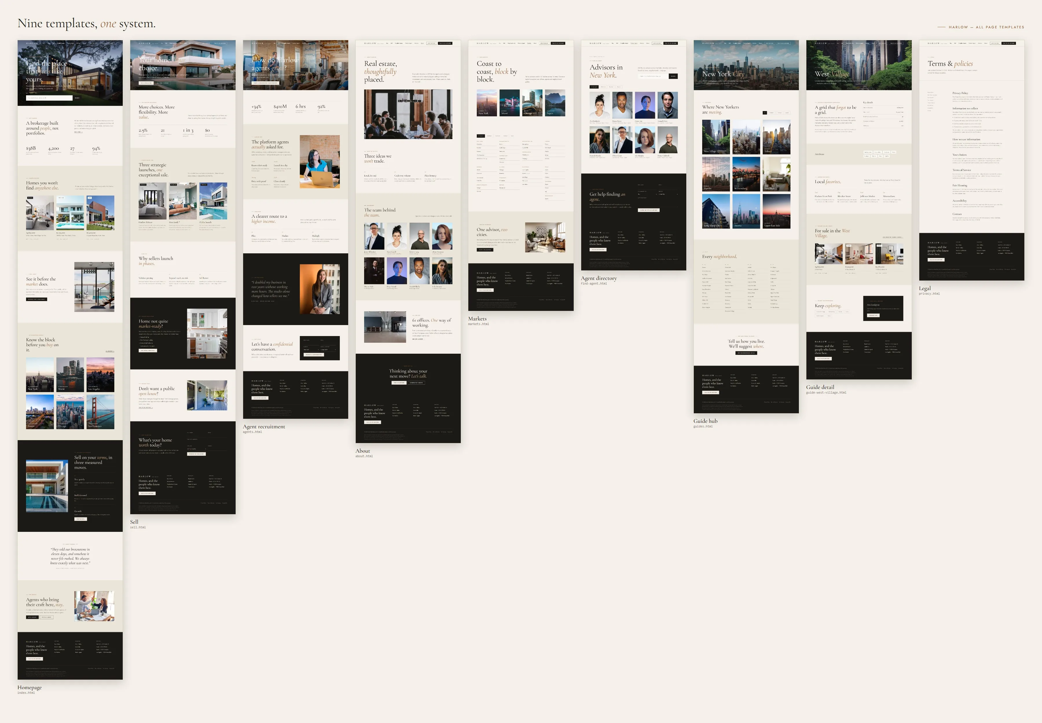
- Templates - 9 page templates covering 250+ audited URLs. This is real estate website development services at brokerage scale.
- Stack - hand-built HTML, CSS and vanilla JavaScript, with no framework
The brief: a luxury real estate website that feels like a place, not a portal
Most real estate listing websites look the same: a search bar, a wall of thumbnails and a lead form that won’t go away. Harlow wanted the opposite. The brief was a real estate broker website, or broker website design, that earns trust before it asks for anything, shows off the brokerage’s private inventory, and gives each of its advisors a credible place online. It named three audiences, each with a different job:
- Buyers and renters want to explore neighborhoods and see exclusive homes early.
- Sellers want to understand Harlow’s marketing approach before they ask for a valuation.
- Agents are weighing up whether to bring their business to Harlow.

Real estate website UX audit: mapping the property platform information architecture
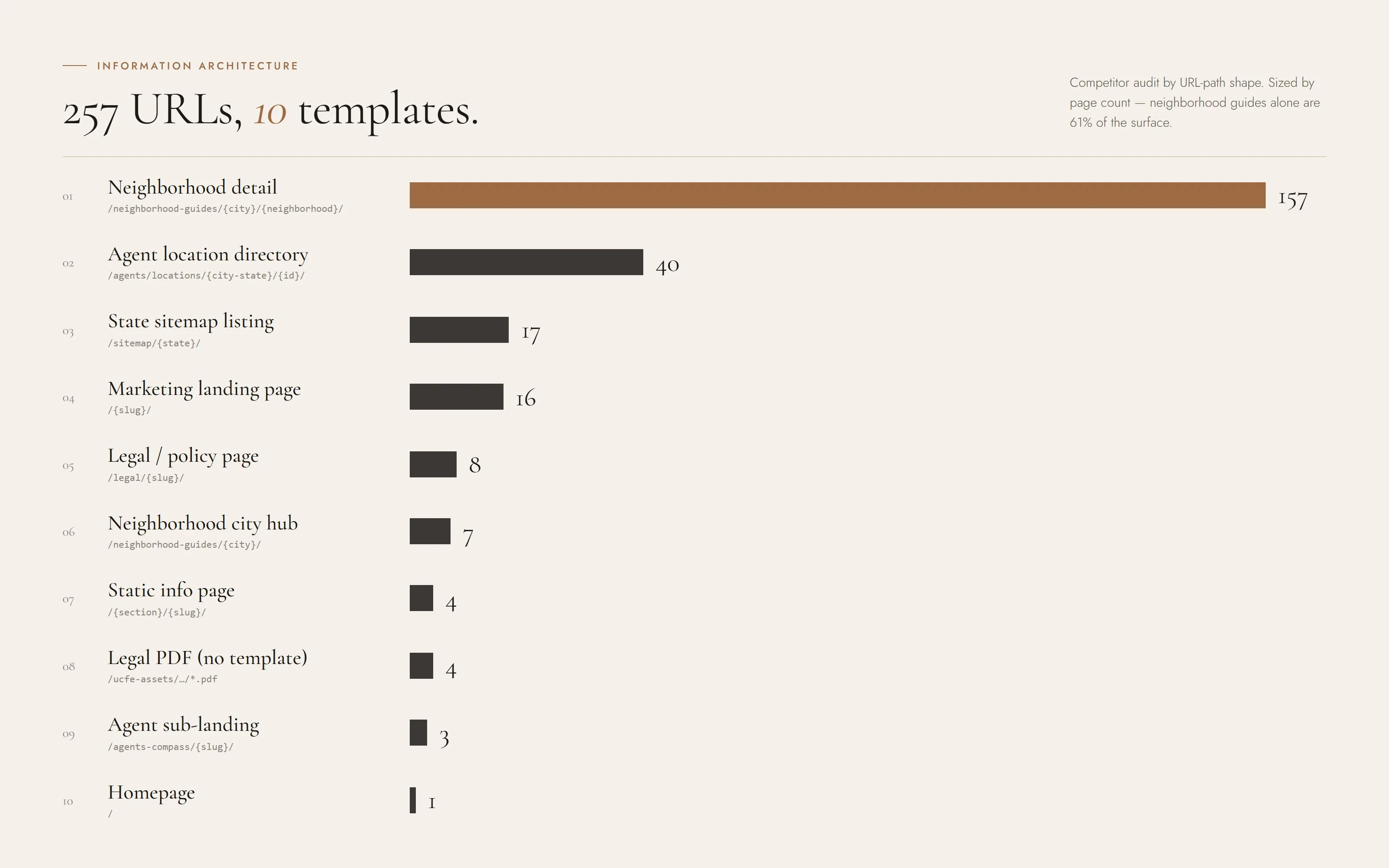
We began with a real estate website UX audit of leading national brokerage websites, cataloging more than 250 live URLs by template, purpose and depth. Most of that surface came from a handful of repeating patterns, with neighborhood guides alone accounting for over 60% of pages. We narrowed the property platform information architecture down to ten core patterns: homepage, a marketing landing page (Sell), agent recruitment, about and leadership, a multi-state market directory, an agent directory by city, a neighborhood guide hub, neighborhood guide detail, legal and policy pages, and downloadable documents (no page template needed).
Designing a small set of strong templates instead of 250 one-off pages keeps the system consistent and the build lean, and it means new markets can launch without new design work. See our UX audit service.
Brand identity: a luxury real estate brand that feels warm and quietly confident
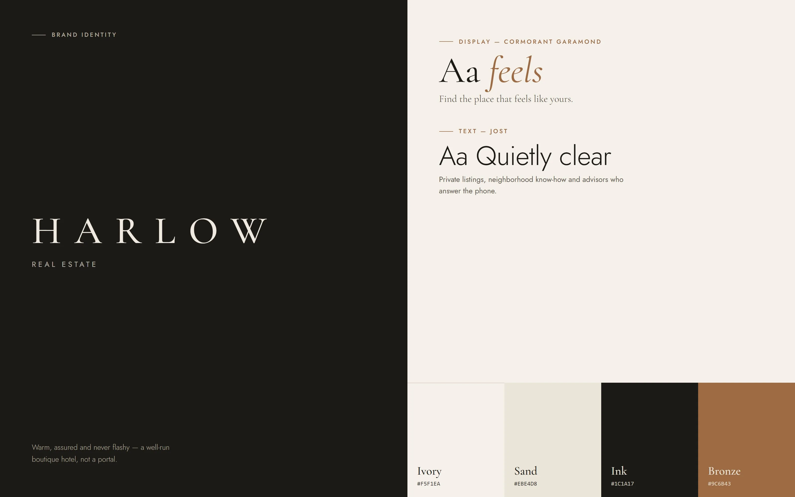
As a luxury real estate branding agency, we start from one question: what should it feel like to walk into this brokerage? For Harlow the answer was a well-run boutique hotel: warm and assured, with nothing flashy and nothing generic. This is the proptech brand identity systems thinking we apply to any property platform.
- Wordmark. Widely tracked, set in a classical serif, with a small Real Estate descriptor. It works as a sign on an office door as well as a favicon.
- Typography. Cormorant Garamond brings editorial elegance to headlines, and its italic carries emphasis (“Find the place that feels like yours”). Jost is a geometric sans in the tradition of mid-century architectural signage, and it keeps body copy and interface text clean without looking like generic software.
- Color. Ivory (#F5F1EA), warm sand (#EBE4D8) and deep ink (#1C1A17), with a single bronze accent (#9C6B43). The palette takes its cues from limestone, oak and aged brass, the materials of the homes Harlow sells.
The brand identity system is built as design tokens, not a static PDF, so the website, print materials and future product UI all come from the same source. See our branding service.
Real estate design system UI: one token file per market
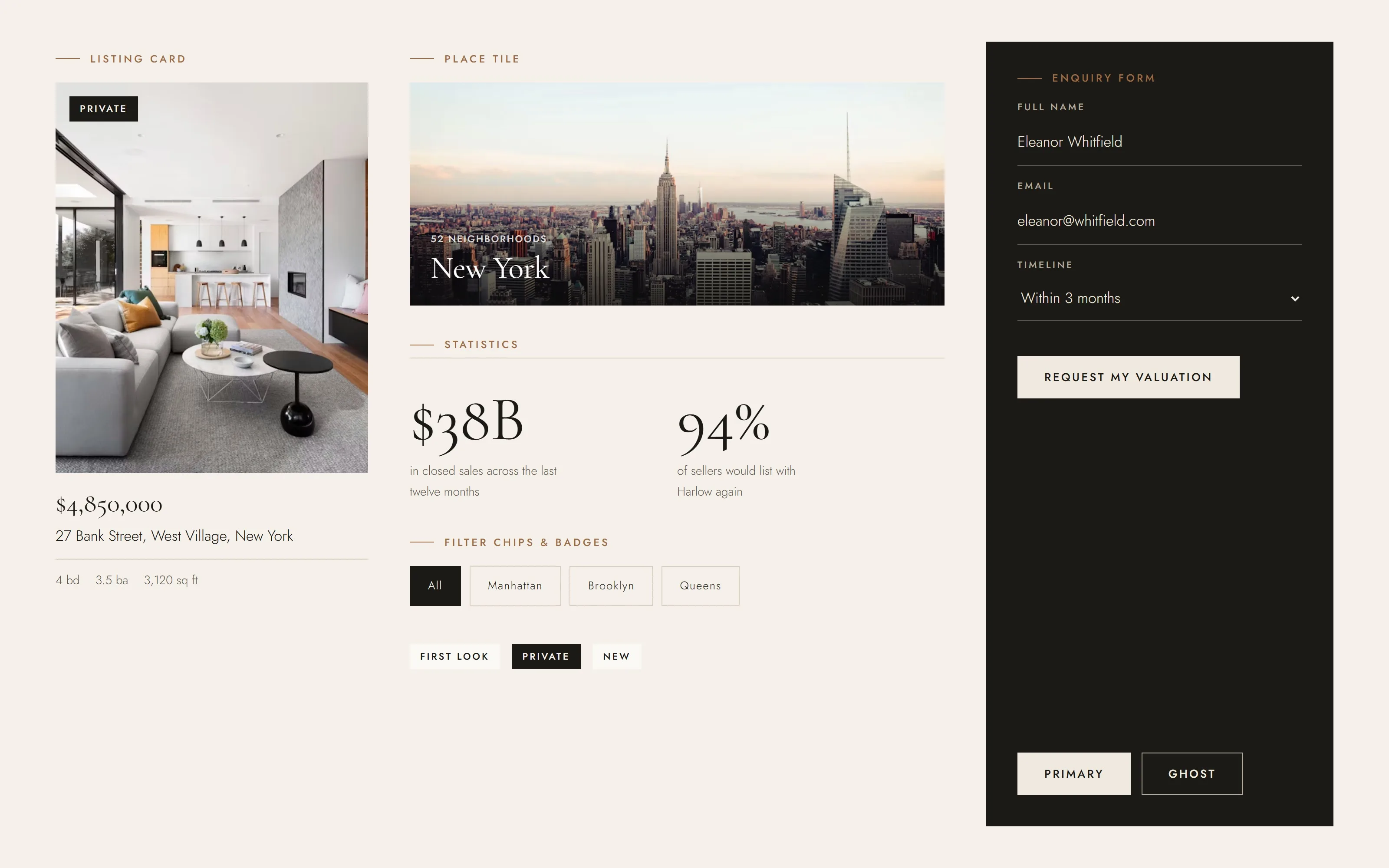
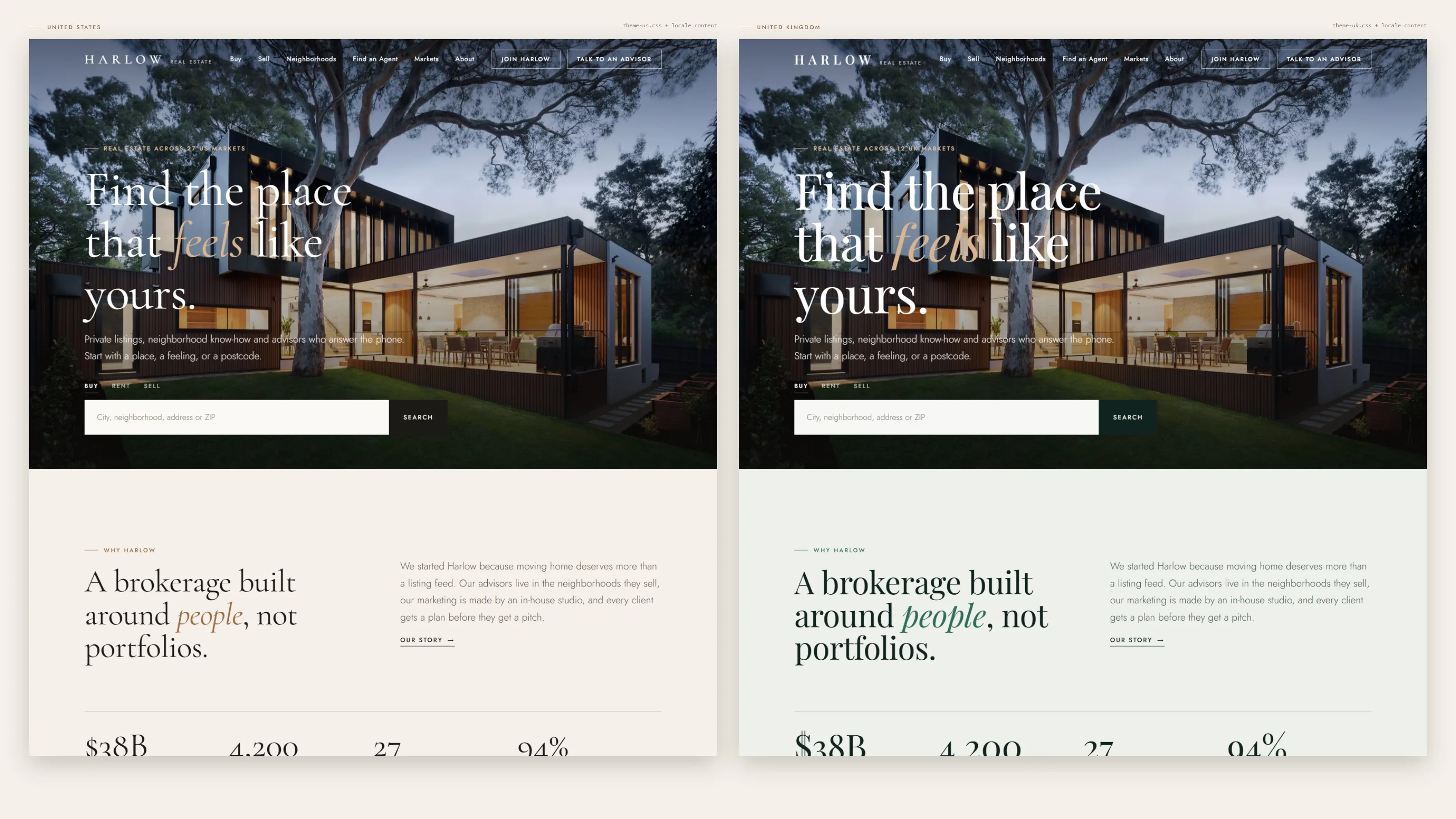
Every color, typeface and spacing value lives in a single theme file. The components only ever reference those tokens, never hard-coded values. A new market or country gets its own look by changing one theme file and one content file, and navigation, footer, office addresses and legal copy are all driven by a per-locale configuration, so the page templates don’t change. Core components:
- Listing card with a status badge (Private, First Look, New)
- Place tile with image, overlay and caption
- Statistic row with large serif figures
- Numbered steps for processes
- Multi-column directory with region filters
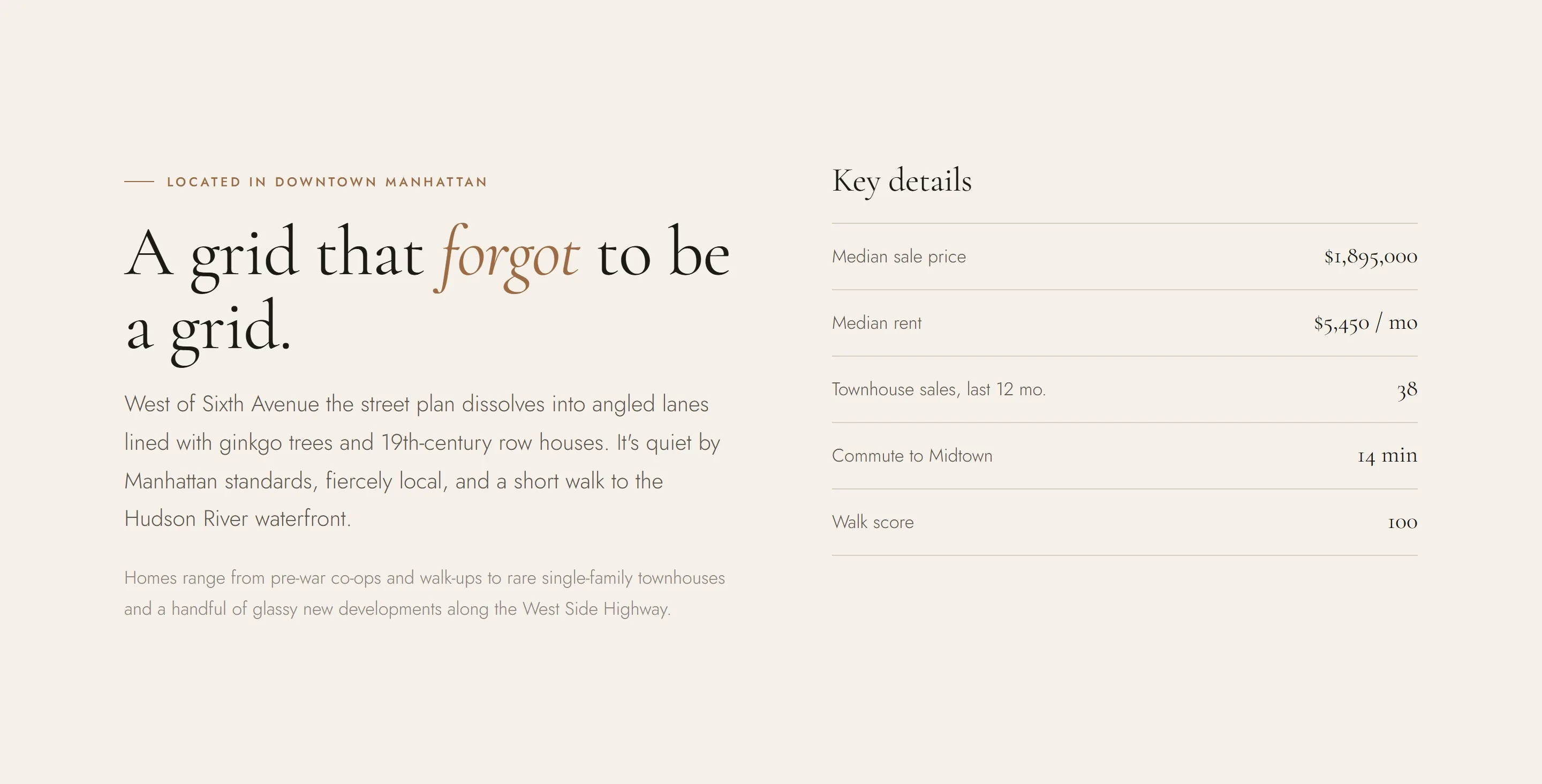
- Facts table for neighborhood data
- Dark-panel enquiry form with underline fields
Homepage: search first, then a story
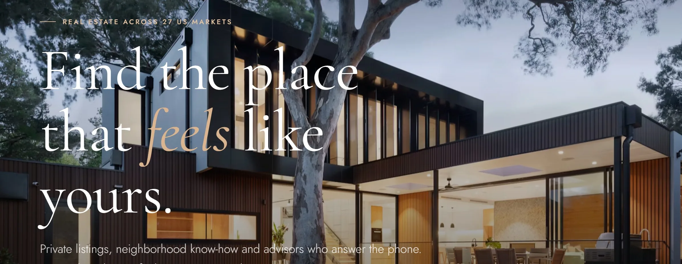
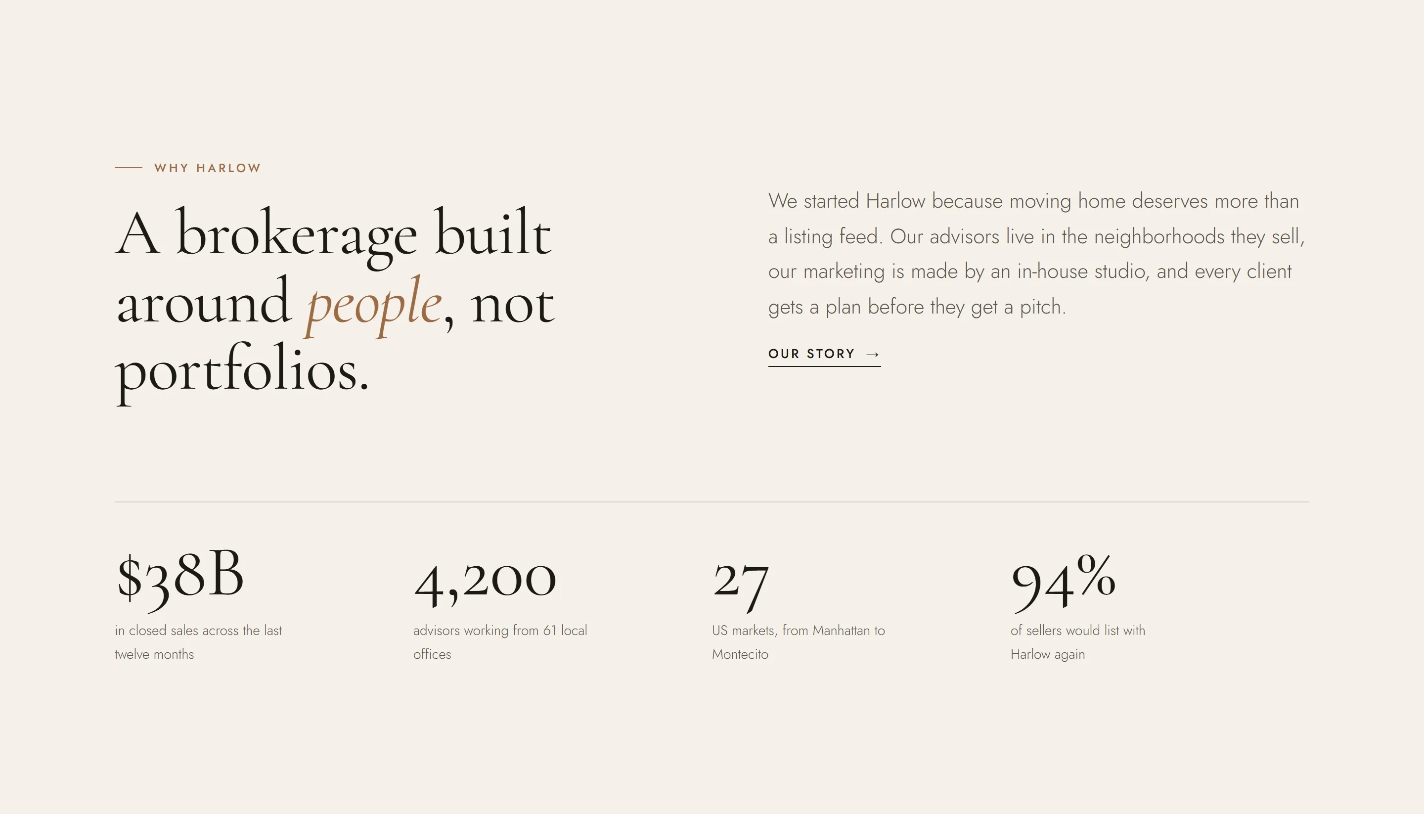
The homepage opens on a full-screen photograph that eases into place with a slow, cinematic zoom while the headline rises in. A Buy, Rent and Sell switch sits in the hero. Changing tabs also rewrites the search prompt, from “City, neighborhood, address or ZIP” to “Enter your home address for a valuation”, so one field serves three intents. Below the fold, the page tells Harlow’s story in a deliberate order: a statement of values, proof in four figures, exclusive inventory, neighborhood guides, a selling teaser, a client quote and a closing invitation to agents.
Luxury listing platform UI: private inventory that feels exclusive
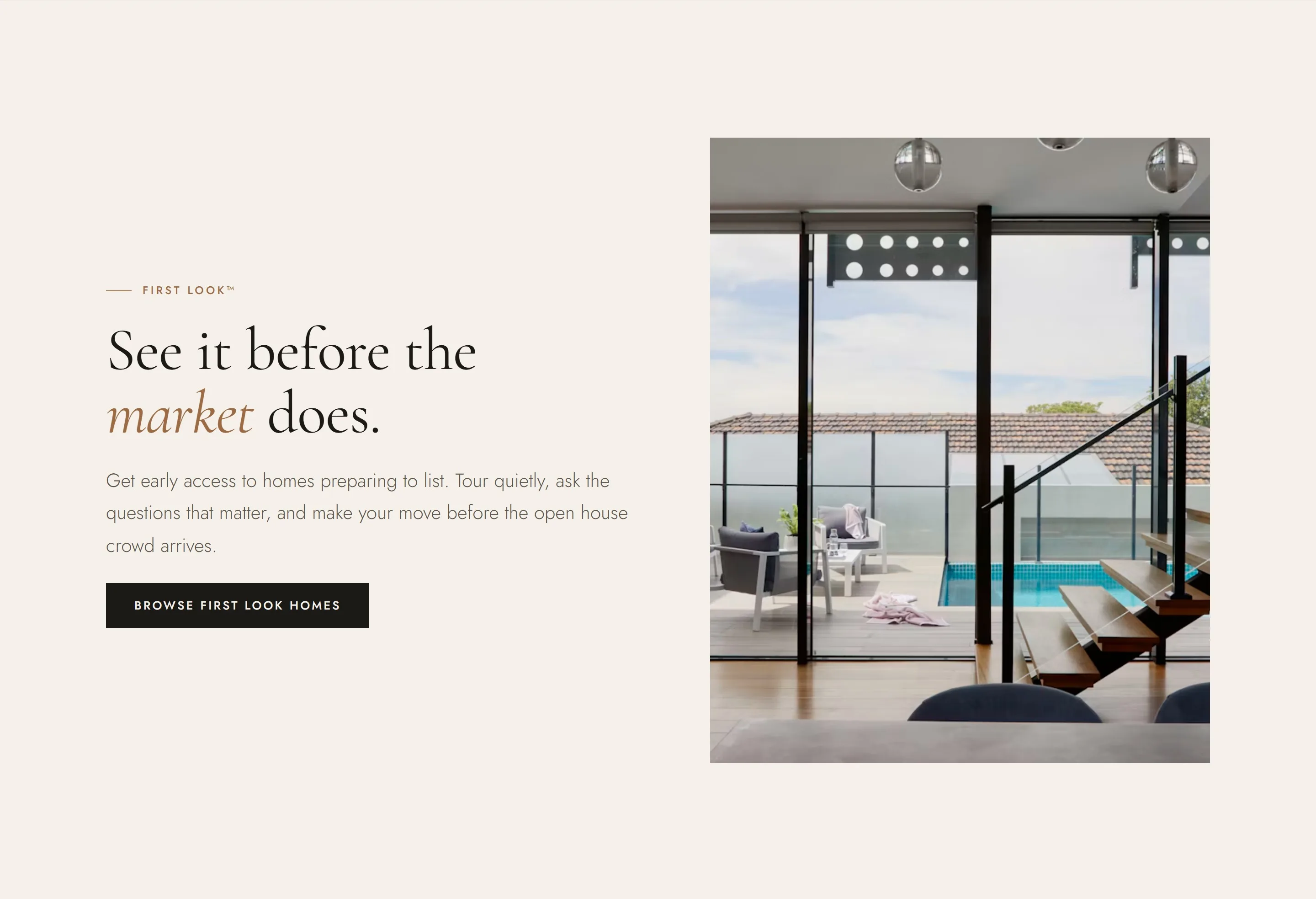
Exclusive listings are Harlow’s biggest commercial advantage, so we designed a listing card that reads more like an editorial spread than a search result, a luxury listing platform UI that rethinks real estate listing websites. Each card has a tall 4:5 image, a quiet status badge, the price set large in serif, and an address with key specs below a hairline rule. On hover the photograph slowly scales up, which feels like stepping closer rather than clicking a button. Status badges let buyers see at a glance how exclusive each home is.
Neighborhood guides: a luxury property content strategy built on local knowledge
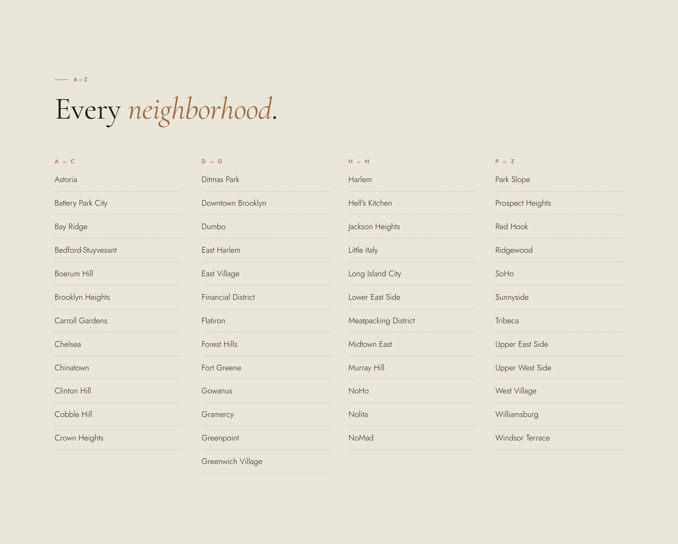
Neighborhood guides are both the most-visited pages on a brokerage site and its best SEO asset. We designed two linked templates:
- City hub. A cinematic city header, featured neighborhoods in a filterable grid (Manhattan, Brooklyn, Queens), then a full A–Z directory set in elegant multi-column type.
- Neighborhood detail. A short editorial overview, a key-details table (median sale price, rent, commute, walk score), attribute tags, local favorites chosen by a named advisor, homes for sale, nearby neighborhoods and a direct line to that local expert.
Each guide is written as if by an advisor who lives there. That gives buyers a reason to stay and gives search engines a reason to rank the page.
Real estate lead generation web design: contact details only where there is a reason
Rather than an always-on pop-up, each enquiry form sits where the visitor already has a reason to act:
- Sell page. A free valuation request at the end of the selling story.
- Agent directory. A “Get help finding an agent” matching service.
- Agent recruitment page. A confidential conversation request.
- Neighborhood detail. A named local advisor card.
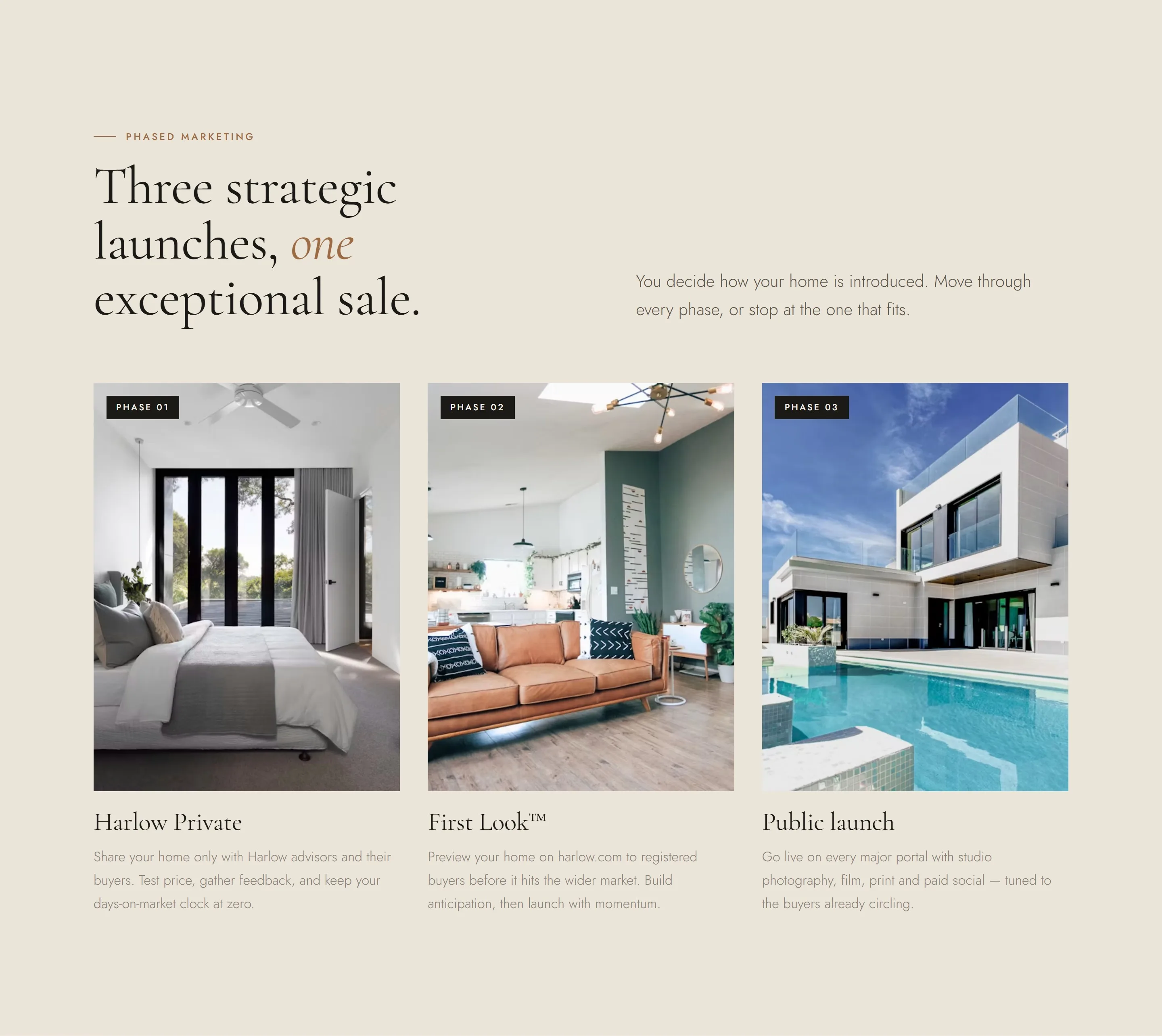
The forms sit on a deep ink panel with minimal underline fields, so they feel like part of the design. A submitted form confirms in place, without a jarring redirect. The Sell page is structured as a persuasive argument: the three-phase launch (Private, First Look, Public), the benefits of each phase, pre-sale improvements funded upfront and private showings, and only then the valuation.
Real estate agent website design: recruitment pages and directories
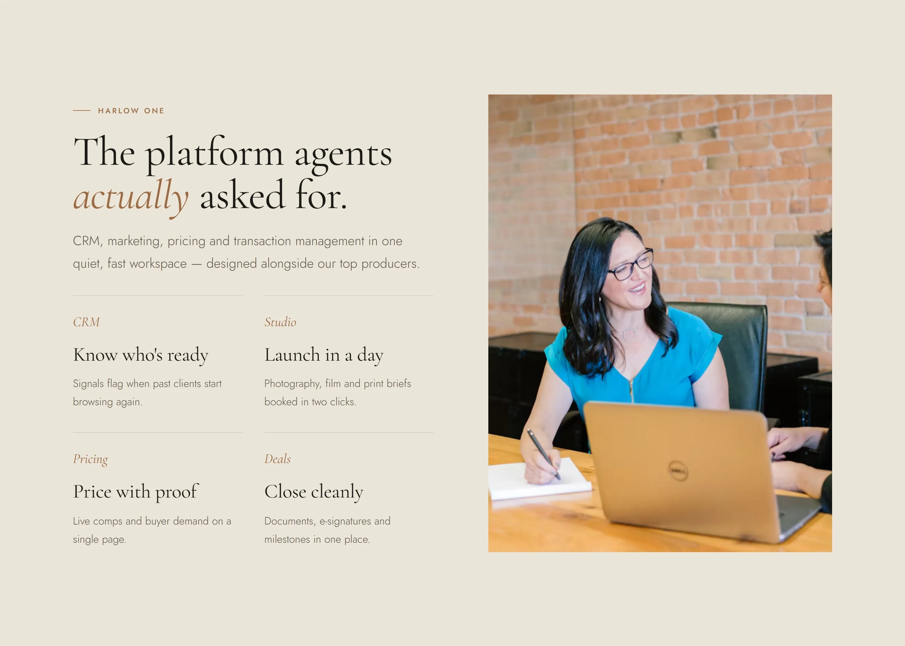
A brokerage succeeds when its agents do, so the website does two agent-facing jobs. The For Agents recruitment page reads like a broker portal UX design brief turned into marketing. It presents the Harlow One platform (CRM, studio booking, pricing and deal management), a three-step growth path, an advisor’s story and a confidential enquiry. The real estate agent CRM UX design thinking shows up in plain-language benefits (“Know who’s ready”, “Price with proof”) instead of feature lists.
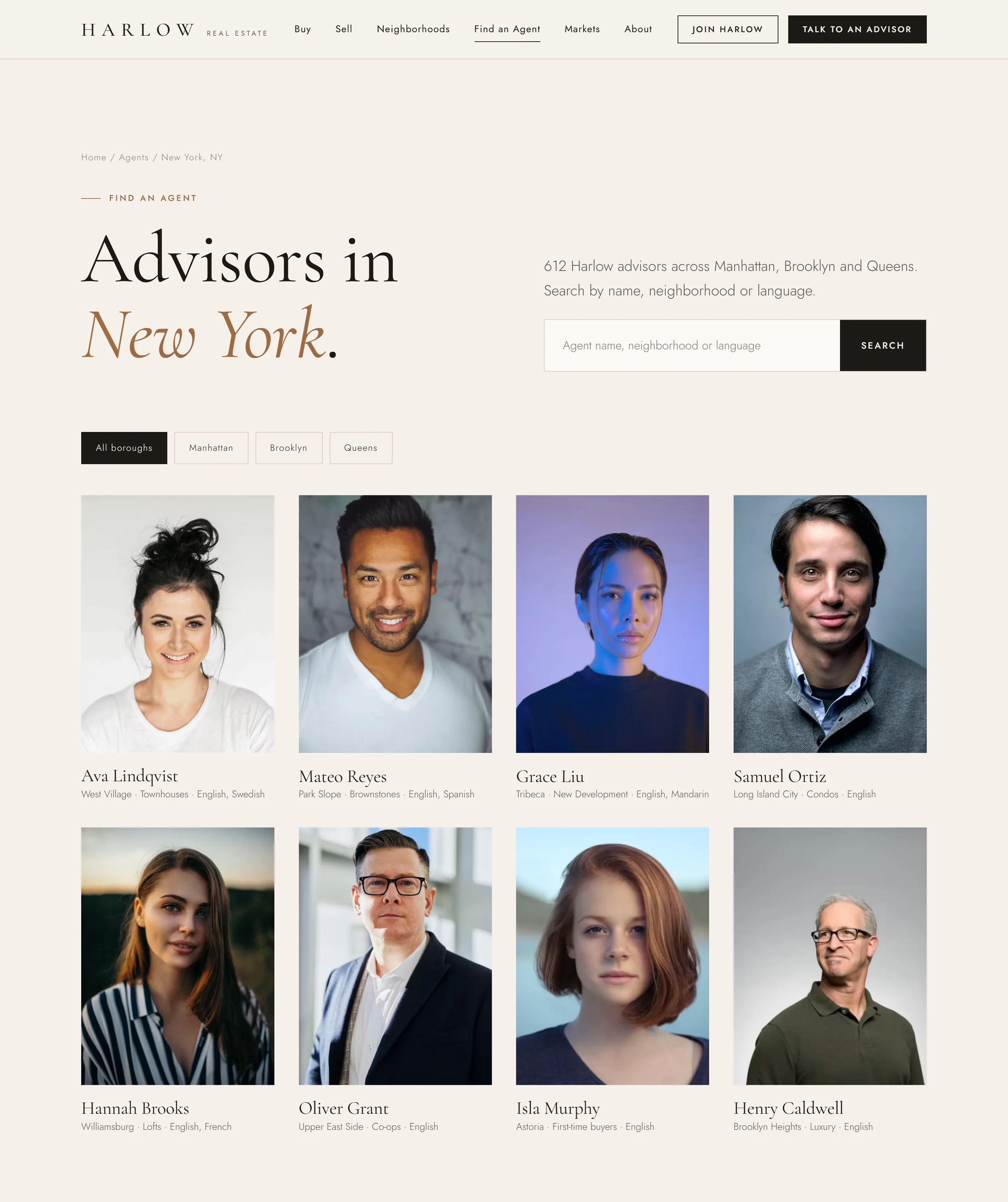
The city agent directory uses portrait-led cards, borough filters and specialty lines that cover neighborhood, property type and language. It is designed to stand alongside the strongest real estate agent website examples and great real estate agent websites, at brokerage scale, for any website real estate agent audience.
Motion and interaction: slow, smooth and deliberate
Every section reveals itself on scroll, with timing tuned to feel like a printed brochure turning its pages rather than an app performing tricks. See our motion design work.
- Hero intro. The photograph settles over 18 seconds with a slow zoom while the eyebrow, headline, subhead and search rise in sequence.
- Staggered reveals. Section content fades and lifts into place, and items in a grid arrive one after another, 80 ms apart.
- Image wipe. Photographs open from a clipped edge while easing back from a slight zoom, like a curtain being drawn.
- Smart header. Transparent over hero images, frosted ivory once the page scrolls, hidden as you read down and back the moment you scroll up.
- Hover states. Navigation links draw an underline from left to right, arrow links nudge forward and imagery scales gently.
- Accessibility. Every animation is switched off for visitors who set their device to reduce motion.
Multi-state brokerage web design: built for 27 markets now and new countries later
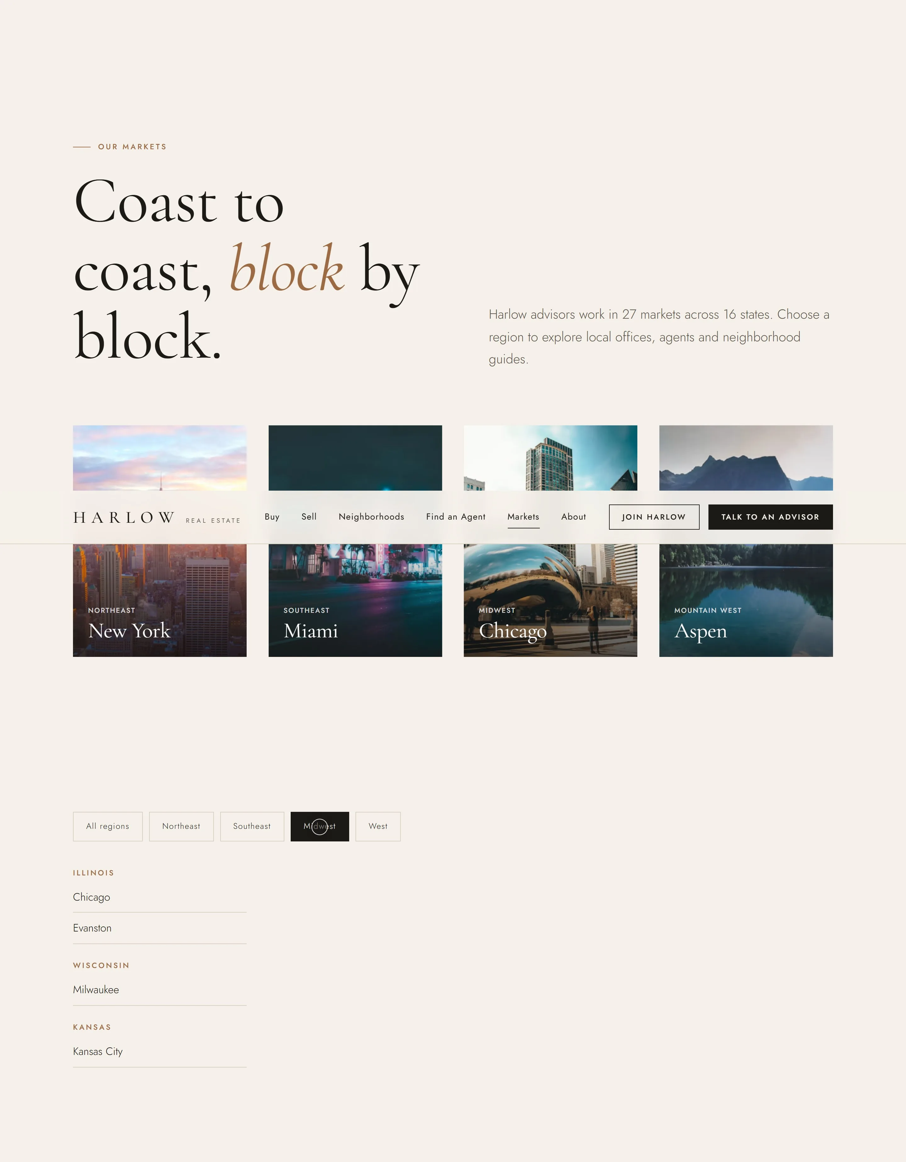
The markets directory organizes the brokerage by region and state, with filter chips for Northeast, Southeast, Midwest and West. A relocation section shows how one advisor relationship can span two cities. Behind it, brand tokens and locale content sit in their own files, so a UK or UAE version can take on its own color, typography and copy (currency, addresses, legal wording) while sharing every template. For a growing brokerage this keeps real estate website development cost-effective: teams launch a market by adding content, without a new project.
Performance and SEO foundations
Our real estate website development approach kept Harlow deliberately light:
- No framework and no build step: hand-written HTML, CSS and vanilla JavaScript.
- About 7 KB of CSS and JavaScript (gzipped) shared across every page.
- The hero image is prioritized and every other image is lazy-loaded.
- Fonts are preconnected and load without blocking text.
- Semantic headings, descriptive alt text, and unique titles and meta descriptions on every template.
- Clean, keyword-relevant URLs for guides, markets and agents.
These foundations give a high-end real estate SEO program a head start. Content marketing and digital campaigns, the work of a real estate digital marketing agency, can then build on pages that are already well structured.
Mobile experience: designed for phones first
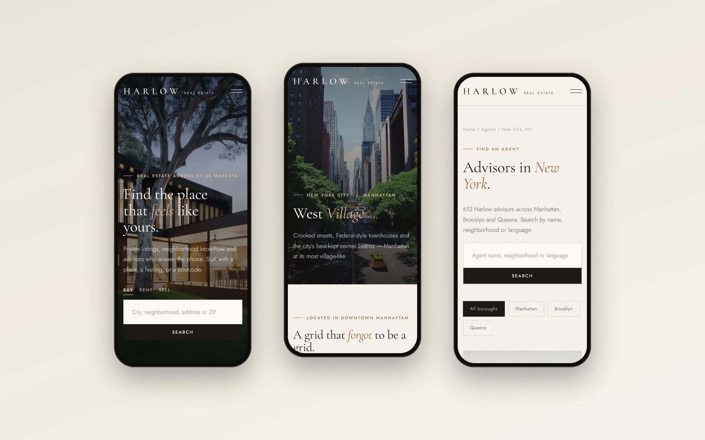
Most property searches start on a phone. On small screens the navigation becomes a full-screen ink menu with large serif links, the search bar stacks, grids fall into a single column and the hero overlay deepens so the text stays readable over any photograph.
Deliverables
- Real estate website UX audit and template inventory
- Information architecture and sitemap
- Brand identity: wordmark, typography, color and voice
- Real estate design system UI with tokens and components
- 9 responsive page templates
- Motion and interaction specification
- Front-end build (HTML, CSS, JavaScript)
- Locale framework for multi-market and international rollout
- SEO foundations: metadata, semantic structure, image optimization
Planning a real estate website?
Whether you’re an independent realtor, a growing brokerage or a proptech platform, our real estate web design agency combines brand, UX and real estate digital marketing in one team. See our web design, branding and UX audit services, real estate work, or start a project.
FAQ
Is Harlow a real brokerage?
No. Harlow is a self-initiated concept we created for this project. The listings, agents, markets and figures are sample content.
What should a real estate brokerage website include?
At minimum: property search, featured or exclusive listings, neighborhood guides, an agent directory, a seller page with a valuation request, a recruitment page for agents, and clear legal and fair-housing information. Harlow's site covers each of these with a dedicated template.
What makes a great real estate agent website?
Trust comes first. That means professional photography, clear local expertise, an easy way to contact a named person, and pages that load quickly on a phone. The strongest real estate agent websites read more like a local magazine than a classified ad.
How do you design a luxury real estate website?
Generous white space, editorial typography, restrained color, large photography and slow, deliberate motion. Luxury also means restraint: fewer pop-ups, fewer competing calls to action and more confidence.
Can one real estate website serve multiple states or countries?
Yes. Separating brand tokens and locale content from templates lets one design system run many markets, each with its own colors, copy, currency and legal wording.
How does real estate website design improve lead generation?
Placing enquiry points where intent is highest (after the selling story, beside a local advisor, inside a matching service) produces better-qualified enquiries than generic pop-ups.
What does a real estate website UX audit involve?
For Harlow, it meant mapping hundreds of competitor URLs into page types, measuring which templates carry the most content and SEO weight, and designing a smaller, stronger set of templates around what users actually need.