

Hearthline Brands: a multi-brand restaurant website built to scale
A concept restaurant group with four quick-service brands. We designed its identity, a brand-themed design system and a 16-template corporate website with a newsroom, franchising and careers.
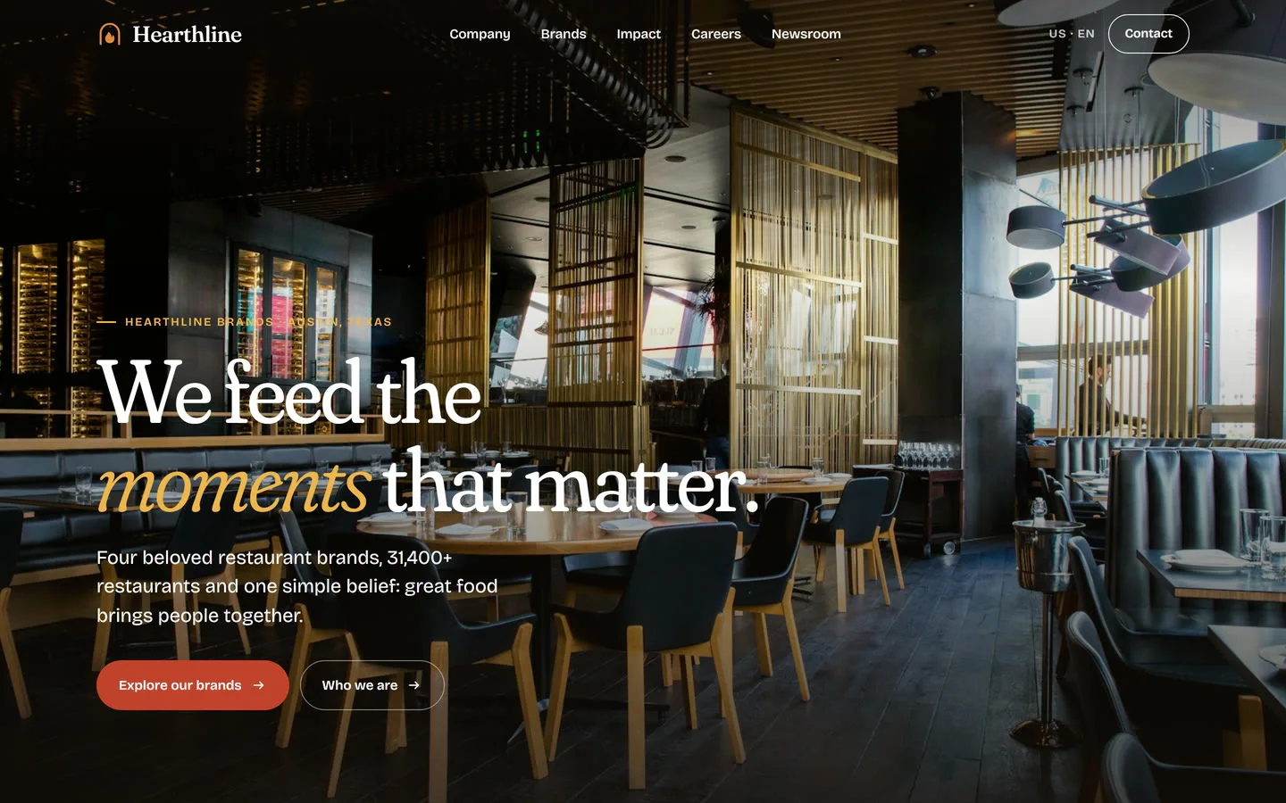
Hearthline Brands is a concept restaurant group that runs four quick-service brands, from Southern fried chicken to hearth-baked pizza, under one corporate roof. We made it to show how a multi brand restaurant digital agency works on an enterprise restaurant group: a digital home as warm as the food and able to handle the complexity of the business. We delivered the brand identity, a modular design system and 16 page templates covering the brand portfolio, newsroom, franchising, careers and impact, built to scale across every market the group serves.
Project facts
- Type - self-initiated concept. Hearthline Brands, its four brands, leaders and figures are sample content.
- 4 restaurant brands, one system
- 16 reusable page templates
- 42 pages at launch
- 1 to many locales from a single content file
- Services - brand identity, UX strategy and information architecture, design system, web design and front-end, motion design, content strategy
The challenge
Corporate websites for restaurant groups often turn into a maze. Investor news sits next to franchise forms, career pages and brand stories, and every brand team wants its own look. We audited a leading global restaurant group’s site to understand the pattern. Its sitemap held 480 URLs but only 16 truly distinct page templates. The rest were duplicated portal URLs, PDF reports and repeated layouts. The brief for Hearthline was clear:
- Make four distinct brands feel like one family without flattening their personalities.
- Give franchise partners, job seekers, journalists and investors a clear path to what they need.
- Build once, then roll out to new countries with copy changes instead of a redesign.
Strategy: information architecture for a multi-unit restaurant group
We started with people, not pages. Our multi unit restaurant marketing web design approach mapped five audiences to five top-level doors: Company, Brands, Impact, Careers and Newsroom. Every page in the system answers one of their questions within two clicks. The audit-first method we use on every restaurant app UX audit shaped the structure:
- Hubs for each section (Company, Impact, Careers) that summarize and route.
- Topic pages for depth: strategy, franchising, people, food and planet.
- Detail templates for brands, leaders, press releases, stories, snapshots, films and quarterly results.
- A filterable newsroom that replaces separate, siloed press, story and video archives.
See our UX audit service.
Restaurant brand identity
As a restaurant brand identity agency, we wanted the parent brand to feel like a kitchen, not a conference room.
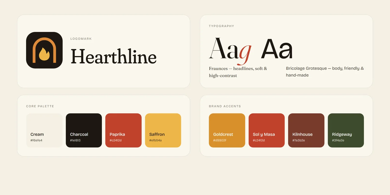
- Mark. Hearthline pairs the hearth, where food and people gather, with the kitchen line where it gets made. The logomark is a hearth arch holding a single flame. It reads clearly at favicon size and works as a watermark at scale.
- Typography. Fraunces, a soft, high-contrast serif with an italic of real character, carries the headlines with the warmth of a menu board. Bricolage Grotesque handles body copy with a friendly, slightly hand-made rhythm. We avoided the rigid, generic grotesques common in SaaS.
- Color. Cream, charcoal, paprika red and saffron come straight from the pass: toasted bread, cast iron, chili and honey. Each restaurant brand adds one signature accent: golden fry, salsa red, brick-oven rust and grill-smoke olive.
- Photography direction. Close, warm and appetizing: hands at work, real kitchens and food at its peak, never sterile stock-style flat lays.
A multi-brand design system that scales
The heart of the project is a multi brand design system UI: one set of components, themed per brand through a single color token.
- Tokens for color, type scale, spacing, radius and motion easing, defined once as CSS custom properties.
- Brand theming. Brand pages inherit a
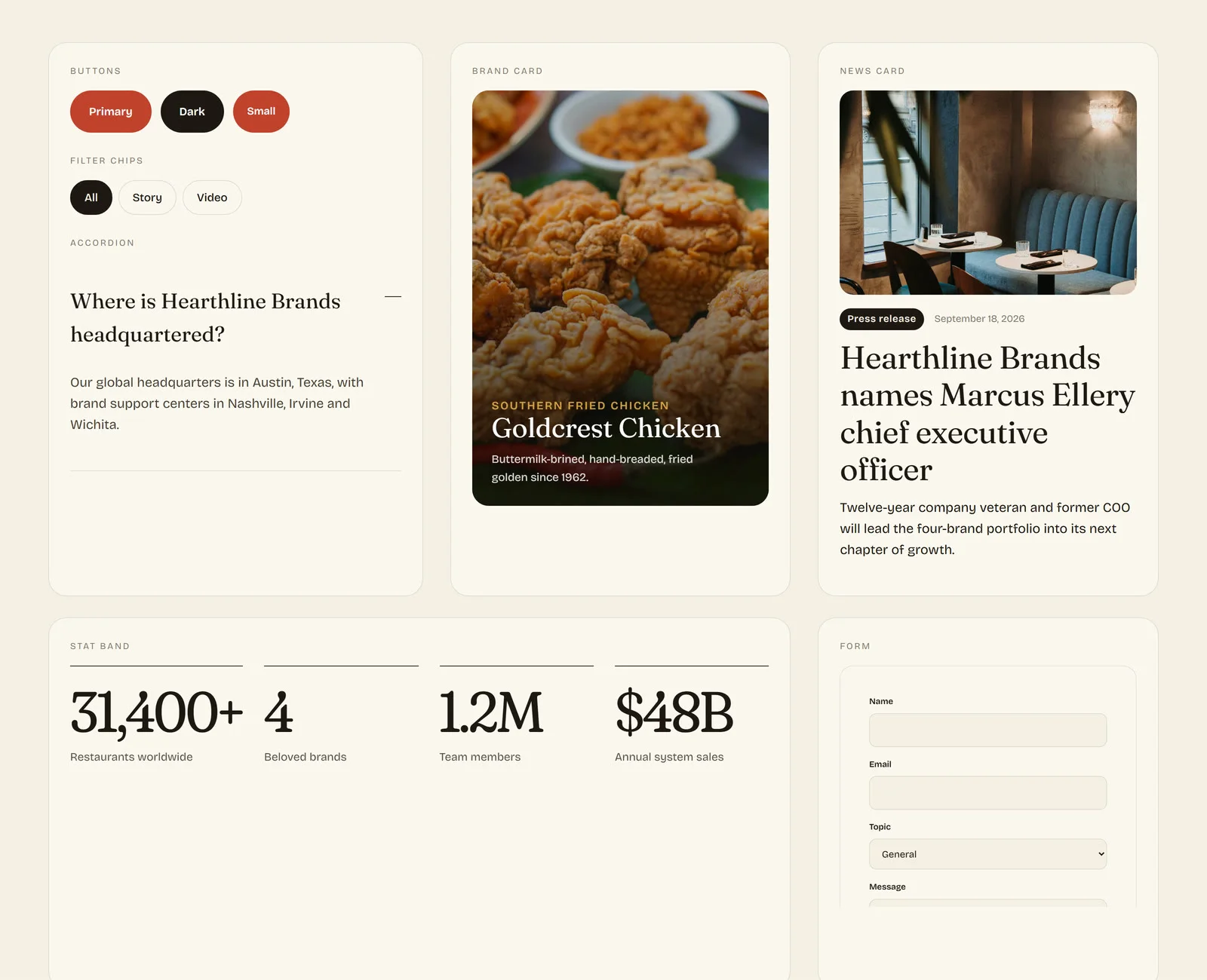
--brandtoken, so the stats band, pull quotes and hover states shift color automatically. A fifth brand needs one new color value, not a redesign. - Components - hero (full and mid), split feature, stat band, brand card, link card, news card, quote, CTA panel, filter chips, accordion, gallery, video poster and form.
- Templates are assembled entirely from those components, which keeps 42 pages consistent and makes future pages quick to build.
QSR web design, template by template
This is QSR web design for the corporate layer of a restaurant business, where brand storytelling and enterprise content live side by side.
Homepage: the whole family at a glance
A full-bleed dining-room hero eases in from a dim zoom. Below it, a slow-scrolling ribbon of brand names leads into a statement that lights up word by word as you scroll. Live counters tick up to restaurants, team members and system sales. The page then flows into brand cards, strategy, impact and the latest news.
Brand detail pages
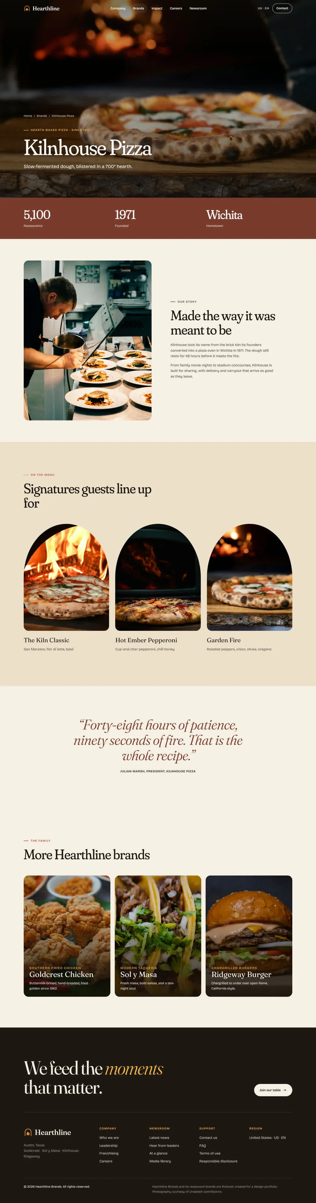
Each brand gets a full-bleed food hero, a signature-color fact band, an origin story and a “signatures” menu row. The dishes sit in arched frames inspired by restaurant windows, so the restaurant menu design feels crafted rather than catalogued. A large italic quote from the brand leader closes the page, followed by cross-links to the rest of the family.
Newsroom with live filtering
One newsroom replaces four separate archives. Filter chips (Press, Story, Snapshot, Video) work alongside a brand selector, and results update instantly without a page reload. A shareable ?brand= URL lets brand teams link straight to their own coverage.
Story, press release, snapshot and film templates
- Stories use editorial treatment: a drop cap, a pull quote and a cinematic lead image.
- Press releases keep a sober wire-service layout, with the corporate boilerplate and media contact on every page.
- Snapshots present event photography in an asymmetric gallery.
- Films open on a poster with a pulsing play control.
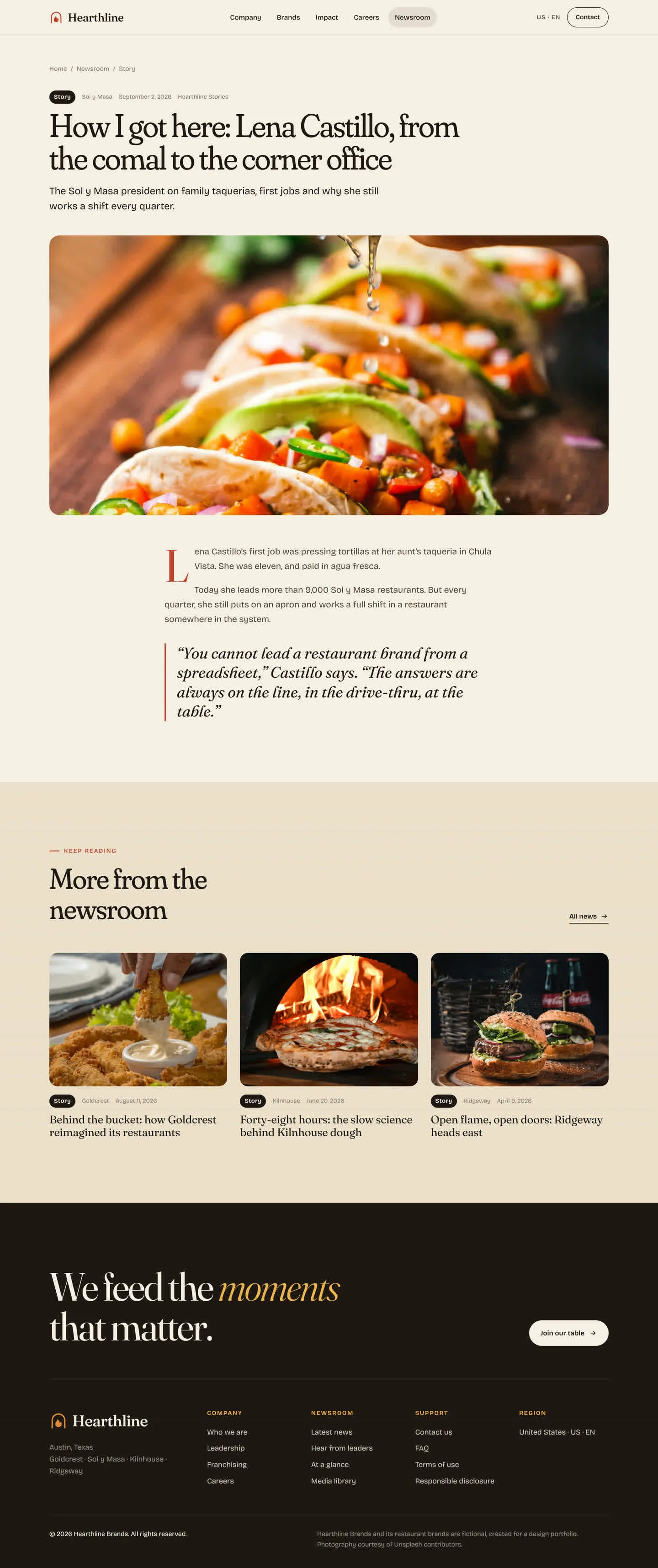
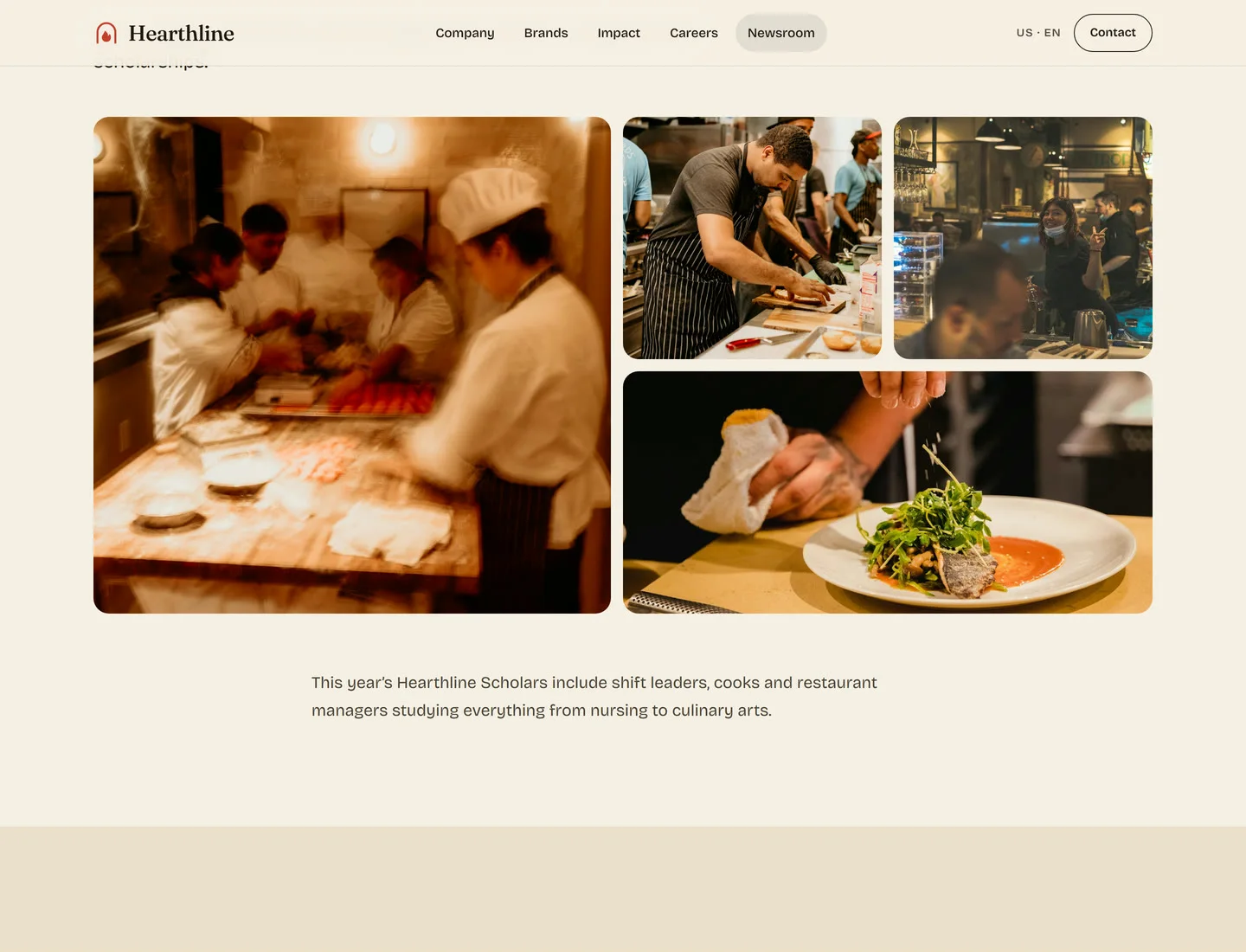
Results at a glance
Quarterly results become a dark, high-contrast infographic: big-number tiles and brand-share bars that grow into place on scroll. It is a clear, investor-friendly take on restaurant enterprise software design patterns.
Leadership and bios
A monochrome portrait grid warms to full color on hover. Each bio page keeps the portrait pinned while the story scrolls beside it.
Careers, impact, media library, contact and FAQ
Careers is built like a restaurant careers website that sells the culture first. Impact pages pair people, food and planet commitments with animated proof points. The media library gives journalists brand logo packs and imagery in one place. Contact and FAQ cover the long tail with an accessible form and accordion.
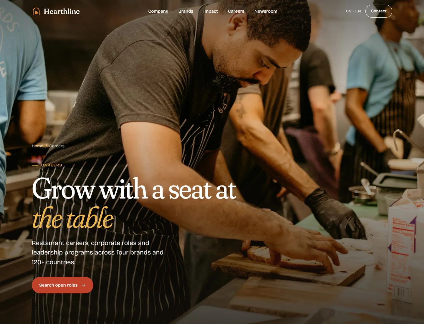
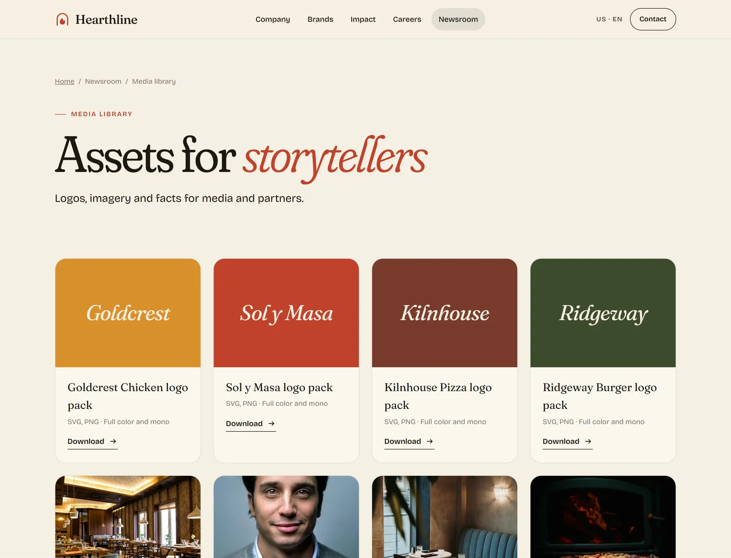
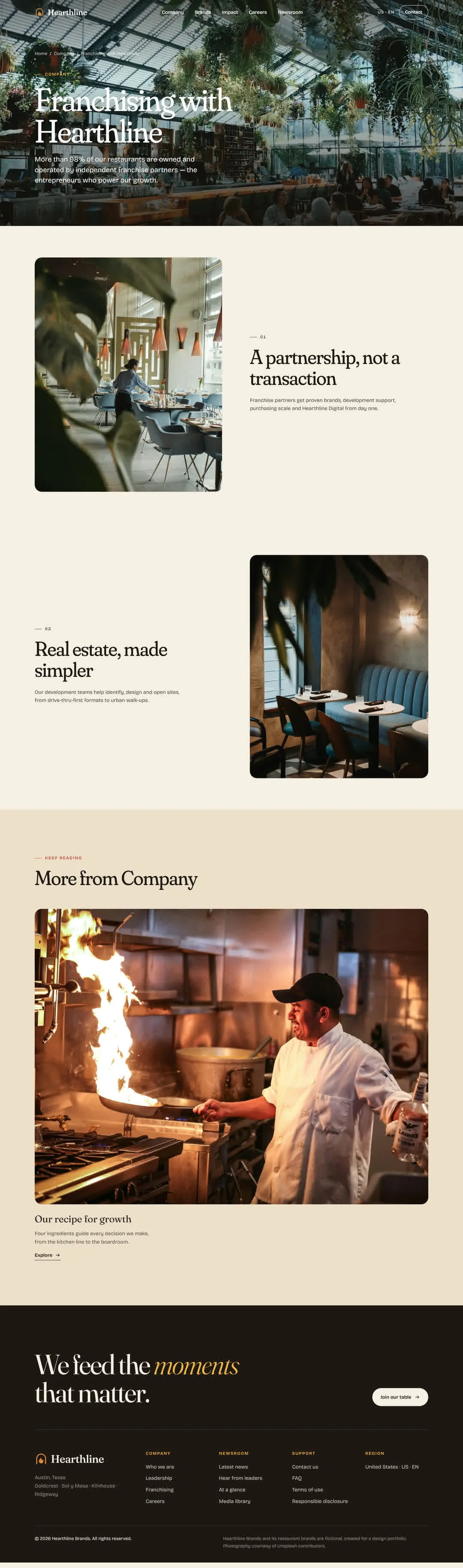
Franchise portal UI/UX design
Franchise partners are the growth engine of any QSR group, so franchising sits in the main navigation, not buried in a footer. The franchising template applies our franchise portal UI UX design principles: lead with the partnership, make franchise requirements and franchise opportunities easy to scan, and route serious enquiries in one step. The architecture leaves room for a gated franchise web portal architecture for operators: onboarding, brand standards and marketing assets, all on the same design system.
Motion and interaction design
Motion is how the site tastes. Every section reveals on scroll, and each interaction is tuned to one shared, slow-out easing curve.
- Hero ease-in - the image settles from a dim 112% zoom to full color.
- Parallax - the hero background drifts slower than the page for depth.
- Word-by-word reveal - each word of an intro statement brightens in sequence as it enters view.
- Count-up stats - numbers roll up to their final values, formatted for each locale.
- Image unmask - a feature image expands from an inset frame while it settles in scale.
- Staggered fade-up - cards and lines arrive one after another.
- Brand ribbon - a continuous marquee of brand names.
- Smart header - turns solid over content, hides on scroll down and returns on scroll up.
- Brand card hover - the photo zooms and an arrow button pops in using the brand’s color.
- Portrait hover - monochrome to full color.
- Filter chips - instant filtering by type and brand.
- Growing bars - brand-share bars fill on scroll.
- Pulse play - a breathing ring around the play control.
- Accordion - the plus morphs into a minus as answers open.
- Mobile menu - a full-screen menu wipes down with large serif links.
Visitors who prefer reduced motion get the full content instantly, with no animation.
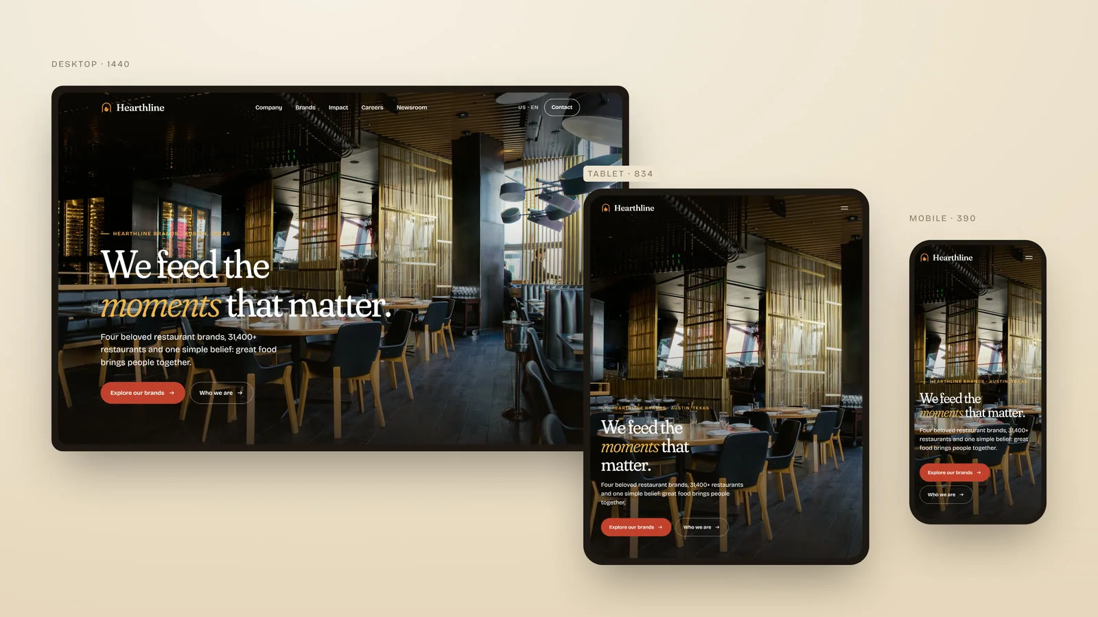
Built for every market
- Static and lightweight. Pages ship as plain HTML with one stylesheet and one small script. There is no framework runtime, and images below the fold load only when needed.
- Locale-ready from day one. All copy, navigation and data live in a single content file per market. A new locale (en-GB, es-MX, fr-CA) is a translated copy of that file plus optional color overrides. The templates and design system stay untouched, and region links appear in the footer automatically. It is the foundation for a multi location ordering platform or market-by-market rollouts.
- Accessible. Semantic landmarks, a skip link, visible focus states, labeled controls,
aria-pressedfilter chips and reduced-motion support.
What’s next: ordering, app and kiosk
The design system was built to stretch beyond the corporate site. The same tokens, type and components extend naturally into:
- Restaurant online ordering app UX design: menu browsing, customization and checkout.
- Quick service kiosk interface UI: large-target, glanceable ordering for in-restaurant screens.
- Food delivery app product design and POS integration UX design for operators.
That continuity is what we mean by food tech user experience: one brand language from the website to the kiosk to the bag on your doorstep. These are directions the system supports, not part of this build.
Deliverables
- Restaurant brand identity: logomark, typography, color and photo direction
- Information architecture and template audit
- Multi-brand design system with brand theming
- 16 responsive page templates and 42 production pages
- A motion and interaction library
- A static front-end build with a locale-ready content architecture
- Content strategy and an SEO-ready copy structure
Building something for hungry people?
We’re a multi-brand restaurant digital agency that turns complex restaurant groups into simple digital experiences, from corporate sites to ordering apps. See our web design, branding and UX audit services, restaurant work, or start a project.
FAQ
Is Hearthline Brands a real company?
No. Hearthline Brands is a self-initiated concept we created for this project. The brands, leaders and figures are sample content.
What does a QSR web design agency do?
A QSR web design agency designs the digital experiences of quick-service restaurant groups, including corporate sites, brand sites, ordering flows and franchise portals. For Hearthline we combined brand identity, UX and a scalable design system in one engagement.
How do you design a website for a multi-brand restaurant group?
Start with a shared design system and let each brand theme it. Hearthline uses one component library with a per-brand color token, so four very different brands feel distinct but clearly belong to one family.
Can one restaurant website work across multiple countries?
Yes. We separate content from templates, so each market has its own content file with local copy, numbers and formatting. The design and code stay the same, which makes rollouts consistent.
What should a restaurant franchise website include?
Clear franchise opportunities, transparent requirements, development and real-estate support, and a one-step enquiry path. Over time it can grow into a gated franchise portal for operator resources.
Do you offer restaurant app UX audits?
Yes. Every project begins with an audit of content, templates and user journeys. For Hearthline, we reduced a typical 480-URL corporate sitemap to 16 core templates.