

Kestrel: designing a modern banking interface for startups
A concept startup-banking platform. We built its brand identity, a 10-template marketing website with a runway calculator, and the design system behind them.
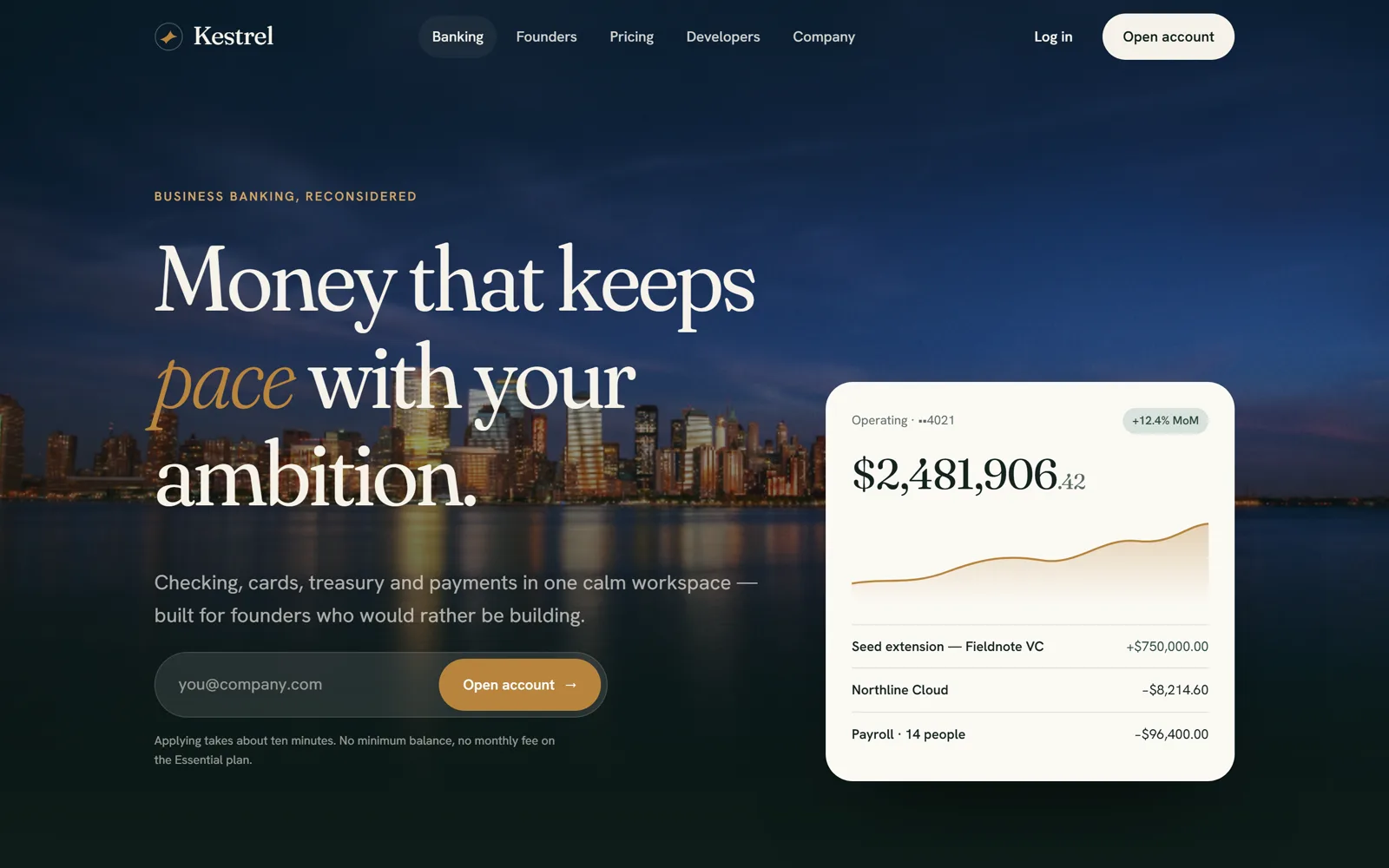
Kestrel is a concept business-banking platform for founders who’d rather be building. As a fintech UI UX design agency, we made it to show how we do modern banking interface design for startup banking: a brand identity, a 10-template startup banking website and the design system behind them, so that business banking for startups feels calm, clear and fast.
Project facts
- Type — self-initiated concept. Kestrel is not a bank, and its products, prices and figures are sample content.
- Industry — fintech, B2B banking, SaaS
- Services — brand identity, UX strategy, website design and build, design system, interaction design
- Platform — static website, responsive from 375 px to wide desktop
- Scope — 10 page templates and about 40 reusable components, built so new countries can be added from day one
The challenge
Business banking for startups is a crowded market. Most products look alike: cold blue palettes, stiff geometric type and dashboards that read like spreadsheets. Founders comparing an online business bank account or business checking accounts (no minimum balance, virtual cards for business) see the same promises everywhere, so the brand and the website experience have to do the persuading. Kestrel needed to:
- Earn trust in seconds. Money is personal, and a site that looks rushed reads as a risk.
- Explain complex products simply: checking, corporate cards, treasury, bill pay and an API, without overwhelming visitors.
- Scale globally with one codebase that could later launch in other countries with local content and small design changes.
- Stay light on every device, because a slow page undermines a promise of reliability.
Our approach: a UX audit before a single pixel
We started with a fintech web app UX audit of leading US banking platforms. We crawled sitemaps, catalogued every page type and narrowed more than 150 URLs down to 18 distinct templates: landing pages, pricing tables, interactive calculators, comparison pages, legal hubs, careers pages and more.
The audit showed which templates do the conversion work, so we designed only what mattered. Kestrel launched with 10 high-impact templates instead of 40 one-off pages.
Brand identity: private banking, not another SaaS startup
As a fintech brand identity agency and startup banking branding agency, we chose a visual language closer to a private bank than to a typical SaaS site.
- Palette. Deep spruce (#0f1f1b), warm linen (#f6f2e9), a brass accent (#b8843d) and sage (#8fa89a). Green suggests growth and stability, brass suggests value, and together they stand apart from the category’s default blue.
- Typography. Fraunces, a soft, warm serif with expressive italics, for headlines, paired with Hanken Grotesk for readable body text. Italic accent words (“money that keeps pace”) give the voice a human touch that geometric sans-serifs rarely manage.
- Logo mark. A stylized kestrel wing. The bird hovers perfectly still before it acts, a metaphor for clarity before decisive action.
- Voice. Short, confident and warm: “One quiet place for every dollar you move.”

A modern banking interface, built in code
Product shots go stale fast. Instead of static mockups, we built Kestrel’s product visuals as live interface components: a balance card with a growth chart, transaction rows and a metal corporate card with a moving light sheen. It’s modern banking interface design that stays crisp on any screen, weighs almost nothing and can be updated in minutes.
Fintech dashboard UX design and financial data visualization design
The hero dashboard follows the rules we use when designing real products:
- Clear hierarchy. The balance comes first, the trend second and recent transactions third.
- Tabular figures, so columns of numbers line up and scan easily.
- Color that carries meaning. Incoming money is green, outgoing money stays neutral, and growth badges are understated.
- Restrained charts. One smooth line with a soft gradient fill and no gridline clutter.
The same approach extends to the stats band, where key numbers count up as they scroll into view.
Corporate card platform UX and treasury management software UI, explained plainly
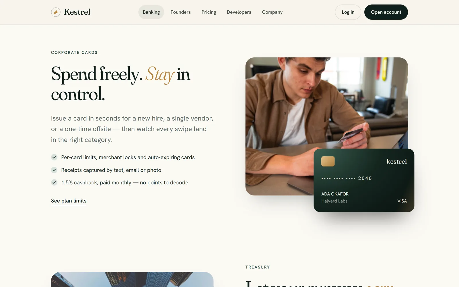
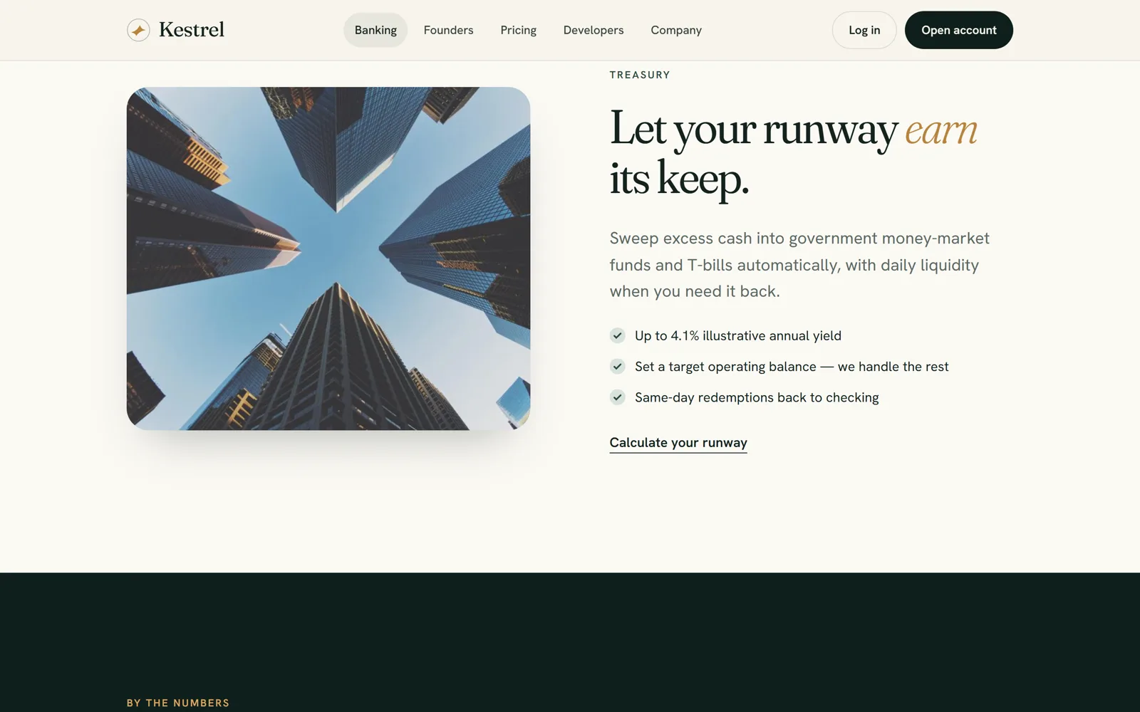
Each product gets a two-column section: a confident headline, three proof points and supporting imagery. We wrote the copy to answer founders’ real questions.
- Corporate cards: “Spend freely. Stay in control.” Per-card limits, virtual cards for business, receipt capture and cashback, with the card overlapping the photo for depth.
- Treasury: “Let your runway earn its keep.” Sweeps and yield in plain English, a model for treasury management software UI content.
Secure portal UI/UX: designing for trust
Security can’t be an afterthought in banking. A tabbed section breaks it into Protection, Permissions and Support, so visitors can go deep without facing a wall of text. Each tab switches with a soft fade, and the panels reuse the same card component as the rest of the site.
An interactive runway calculator
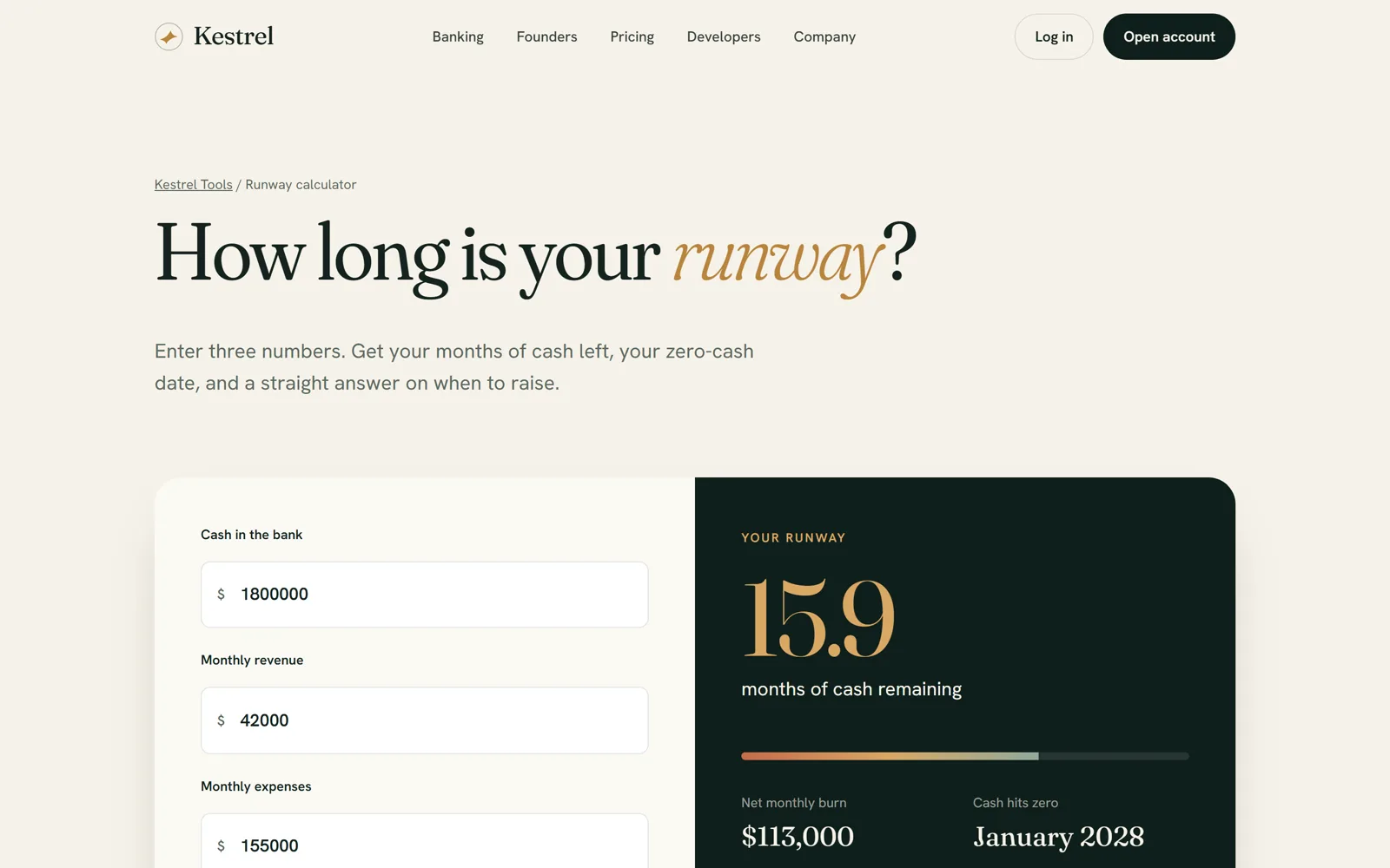
We designed a startup runway calculator that updates live as you type. It shows months of runway, net monthly burn and the date the cash runs out, with a color-graded meter and plain-English advice (“plan your next raise about 9 months before zero”). The long-form explainer underneath has a sticky table of contents and is written around the questions founders search for, as part of a fintech content marketing strategy.
Pricing and comparison pages
- Pricing. Three tiers with a featured middle plan, a monthly and yearly switch that recalculates prices instantly, and a grouped comparison table, so there are no surprises in the fine print.
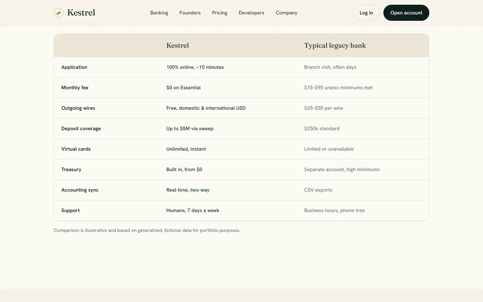
- Comparison. A side-by-side table aimed at founders searching for the best bank for startups, with Kestrel’s advantages shown in green.
A complex SaaS design system, kept simple
Behind the site is a token-based fintech product design system, the kind of B2B fintech product design that scales:
- Design tokens for color, type, spacing, radius and motion, all in one place.
- About 40 components — buttons, email capture, feature cards, two-column sections, stats, testimonials, tabs, accordions, pricing cards, data tables, the calculator, a code block, a call-to-action band, header and footer.
- One motion language. Content fades up in sequence, images slide into view, numbers count up, cards lift slightly on hover, logos scroll in a slow marquee and FAQ answers open with a rotating plus icon.
- Accessible by default. It respects the reduced-motion setting, uses semantic HTML, keeps focus states visible and uses readable contrast on dark sections.
Built for global scale
Kestrel’s US site is the template for future markets. Shared content (navigation, footer, legal notes, calls to action), the locale and the currency live in one configuration file. Prices and calculator values reformat for each country’s currency, and the design tokens can be overridden per country. Launching a UK version means translating one file, not rebuilding a website.
Lightweight by design
The site uses no frameworks, no page builder and no third-party scripts, just hand-written HTML, CSS and JavaScript.
- About 14 KB of code per page, gzipped (CSS about 5.7 KB, JavaScript about 3.3 KB, HTML about 5 KB)
- Images load as they come into view, and the hero image is preloaded
- Fonts are preconnected and use
font-display: swap
Responsive by design
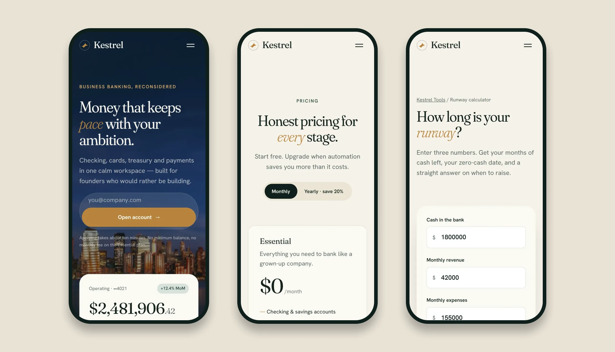
Every template was designed mobile-first. On phones the sections stack into a single column, email capture becomes a full-width form and navigation collapses into a calm full-screen menu.
What we delivered
- A brand identity: logo mark, color and type system
- A UX audit and sitemap strategy
- 10 responsive page templates, including a pricing page, a comparison page and an interactive runway calculator
- A design system and component library, with motion guidelines
- A multi-country architecture and a static front-end build
Building a fintech or SaaS product?
We’re a SaaS design agency for financial software: banking apps, dashboards, design systems and websites that turn trust into sign-ups. Whether you need a banking app design agency, a SaaS website design agency, a financial software design agency or a full fintech UI UX design agency partner, see our web design, design systems and branding services, or more work in the finance and fintech industry.
FAQ
Is Kestrel a real bank?
No. Kestrel is a self-initiated concept we created for this project. It isn't a bank, and the products, prices and figures are sample content.
What does a fintech UI UX design agency do?
It designs the brand, website and product interfaces for financial companies: dashboards, onboarding, pricing, design systems and the content that explains complex products simply.
How do you design a banking or fintech interface?
We start with hierarchy: the balance first, the trend second, the detail third. Then we use tabular figures, color that carries meaning and restrained charts, so people can read their money at a glance.
Can one fintech website work across multiple countries?
Yes. Shared content, locale and currency live in one configuration file, and design tokens can be overridden per country, so a new market means a new content file rather than a new site.
Do you run UX audits on existing fintech websites?
Yes. A fintech web app UX audit like the one behind Kestrel maps sitemap and templates, conversion paths, accessibility and technical SEO, and ends with a prioritized action plan.