

Lumi Early Learning: an education website designed for curious families
A concept preschool network. We ran a UX audit, built the brand and design system, and hand-coded a multi-locale static site: 29 pages, 13 templates and a four-step online application.
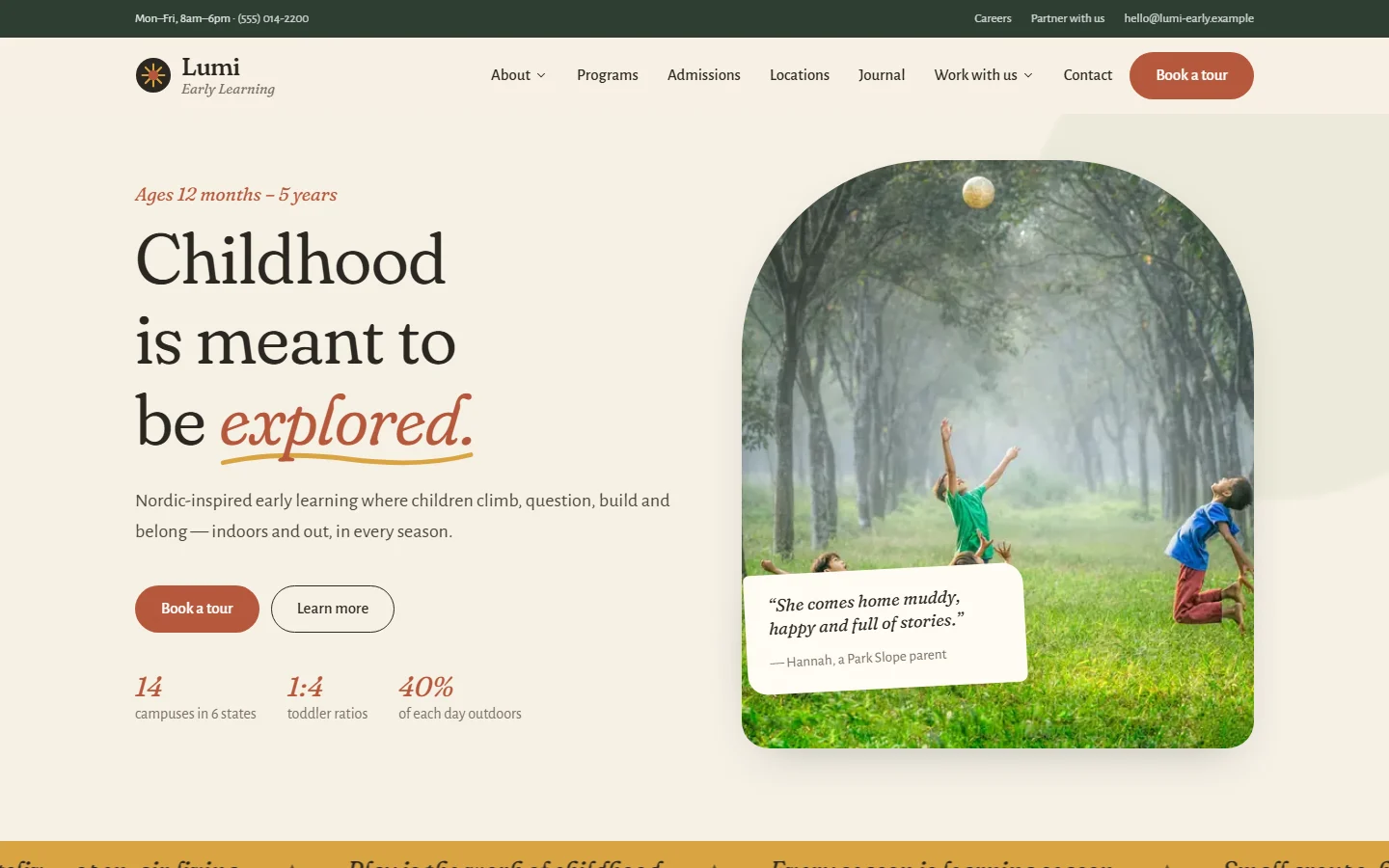
Lumi Early Learning is a concept network of Nordic-inspired preschools, made to show how we do education website design and education website development as an education web design agency and edtech design agency. Families had to feel the calm of a Lumi classroom within seconds, find a campus near them, understand tuition and apply without a phone call. We handled the whole project: a UX audit, brand identity, a modular design system and a hand-built static site that is ready to roll out to new countries.
Project facts
- Type — self-initiated concept. Lumi, its campuses, programs and tuition are fictional.
- Industry — early childhood education, preschool and daycare
- Services — UX audit, information architecture, brand identity, UI design, front-end development, SEO
- Scope — 29 pages, 13 reusable templates, 6 campus pages, a 4-step online application
- Built for — mobile-first use and a multi-locale rollout
The challenge: preschool websites that feel like software
Most preschool websites fall into one of two traps. Some are cluttered noticeboards. Others are slick but cold, built on the same SaaS templates as a project-management tool. Neither earns the trust of a parent choosing who will care for their two-year-old.
The brief for this education website design:
- Show the philosophy, not just say it. Play-based learning, daily outdoor time and small groups had to come through in imagery and tone.
- Make preschool enrollment and daycare admission effortless. Tours, tuition, applications and campus details had to be one or two clicks from any page.
- Scale without a rebuild. New campuses and new countries should mean new content, not new code.
Research: a UX audit before a single pixel
Every good website redesign case study starts with evidence, and this edtech UX audit is no exception. We audited an established international Nordic preschool network to learn what works and what breaks at scale. The audit found:
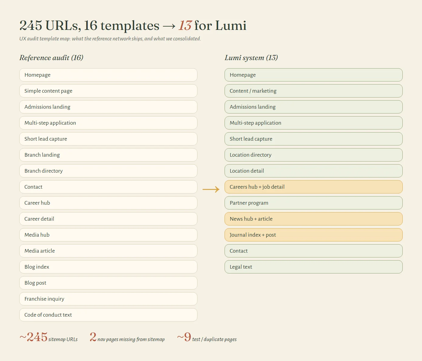
- About 245 URLs, only 16 real templates. Behind a large sitemap sat a small set of repeatable layouts, which told us Lumi needed a system, not a set of pages.
- The sitemap hid pages. Two pages linked from the main navigation weren’t in the XML sitemap at all, which makes them harder for search engines to find.
- Template drift. Around nine test, copy and outdated pages were still live: duplicated admission forms, old factsheets, unfinished drafts.
- Admissions sprawl. More than a dozen near-identical admission landing pages split traffic and diluted rankings.
We mapped every page type onto 13 consolidated templates, each with a clear job in the parent’s journey: discover, trust, visit, apply.
Strategy: information architecture built around the parent journey
Parents don’t browse a preschool site. They arrive with questions. Is it near me? Is it safe? What will my child do all day? What does it cost? We built the navigation around those questions:
- About — our story, our approach and a newsroom, for trust and philosophy
- Programs — age groups from 12 months to Pre-K, with ratios, hours and tuition side by side
- Admissions — steps, transparent tuition, FAQs and an enquiry form
- Locations — a filterable campus directory that feeds into campus pages
- Journal — content that answers real parenting questions
- Work with us — careers and a partner program
“Book a tour” stays in the header on every page. It’s the single most valuable action on the site.
Brand identity: warm, grounded and human
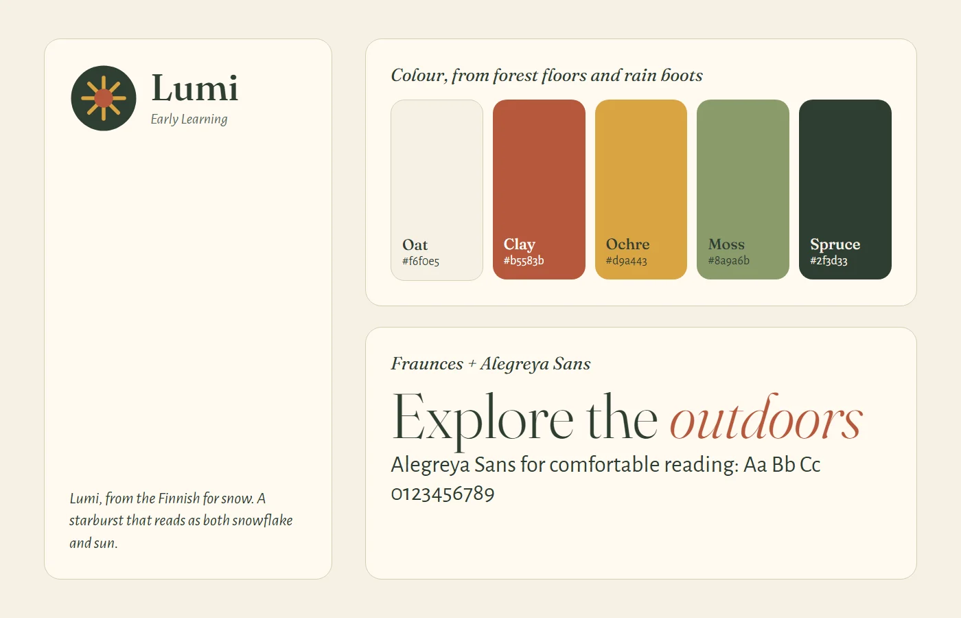
Lumi comes from the Finnish word for snow. The logo mark is a soft starburst that reads as both a snowflake and a sun, a quiet nod to friluftsliv, the Nordic idea of open-air living in every season. We steered away from the edtech look:
- Color. No electric blues or neon gradients. An earthy palette of oat (#f6f0e5), clay (#b5583b), ochre (#d9a443), moss (#8a9a6b) and spruce (#2f3d33), taken from forest floors and rain boots.
- Typography. Fraunces, a soft, slightly quirky serif for headlines, paired with Alegreya Sans, a humanist sans with calligraphic roots, for comfortable reading.
- Tone. We dropped uppercase overline labels for italic, sentence-case introductions that sound like a teacher talking.
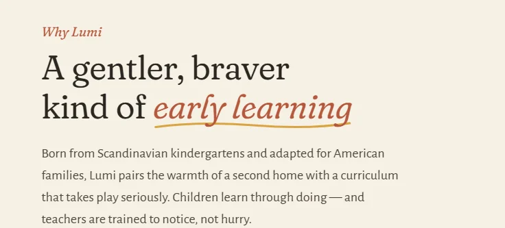
Small handmade details carry the personality: a hand-drawn ochre underline beneath key words, organic blob shapes behind icons and numbers, and a slightly tilted parent’s note on the homepage photo instead of a star-rating widget.
Design system: thirteen templates, one voice
Every page is assembled from shared components: heroes, image-and-text splits, feature grids, testimonial carousels, galleries, FAQs and forms. A new page means arranging blocks, not designing from scratch. Our design systems work follows the same principle.
Homepage. An editorial, long-scroll story: the promise, the philosophy in six pillars, programs by age, family testimonials, a photo mosaic, nearby campuses and the latest journal articles.
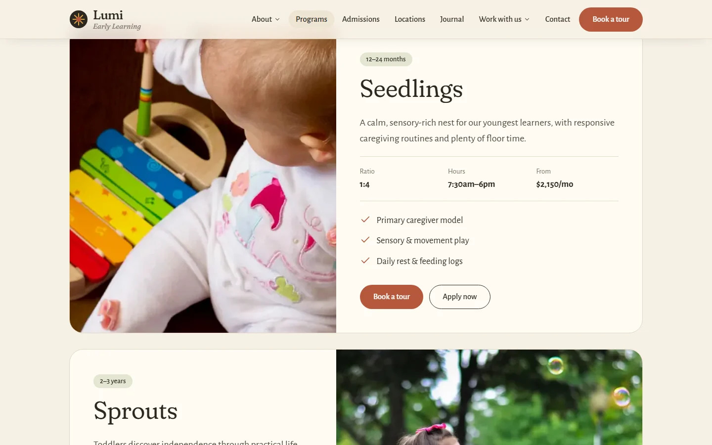
Programs. Each age group, from Seedlings (12–24 months) to Pathfinders Pre-K, gets a full row with ratio, hours and starting tuition, so families can compare preschool programs and early childcare curriculum at a glance.
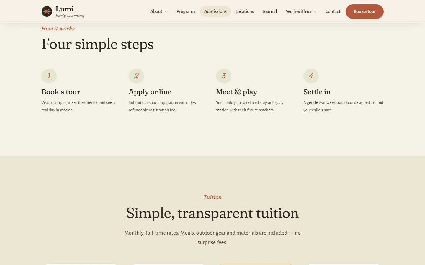
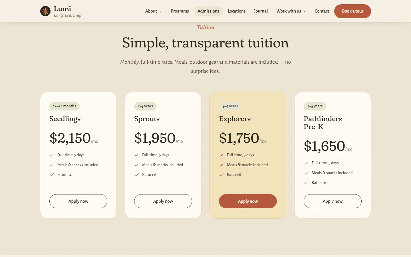
Admissions. A four-step path, transparent monthly tuition, an enquiry form and an FAQ that answers what admissions teams hear daily. It’s built for edtech website conversion: every section ends with a clear next step.
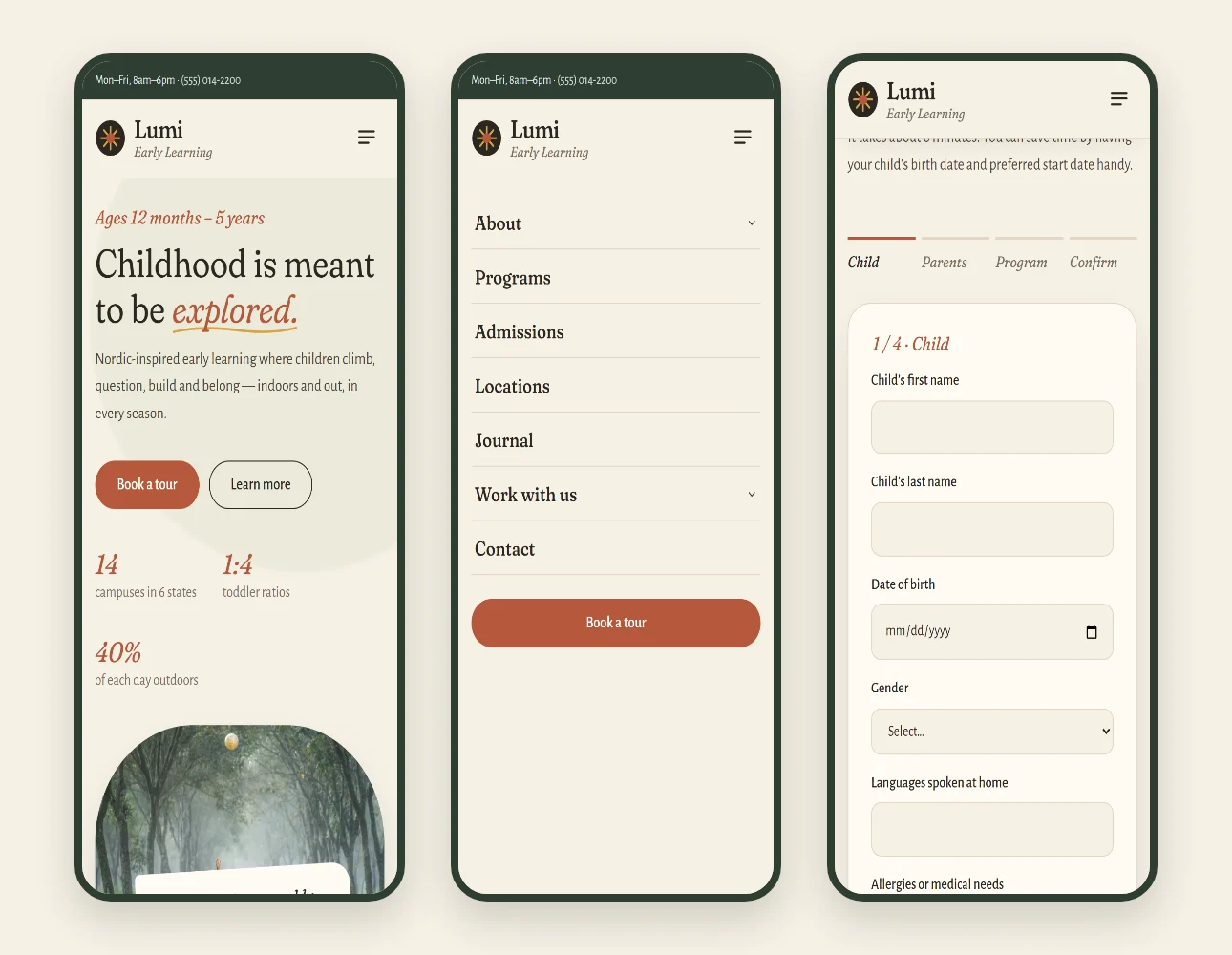
Online application. A four-step form (Child, Parents, Program, Confirm) with progress, per-step validation and a reassuring success state, which turns a daunting daycare admission process into a short task.
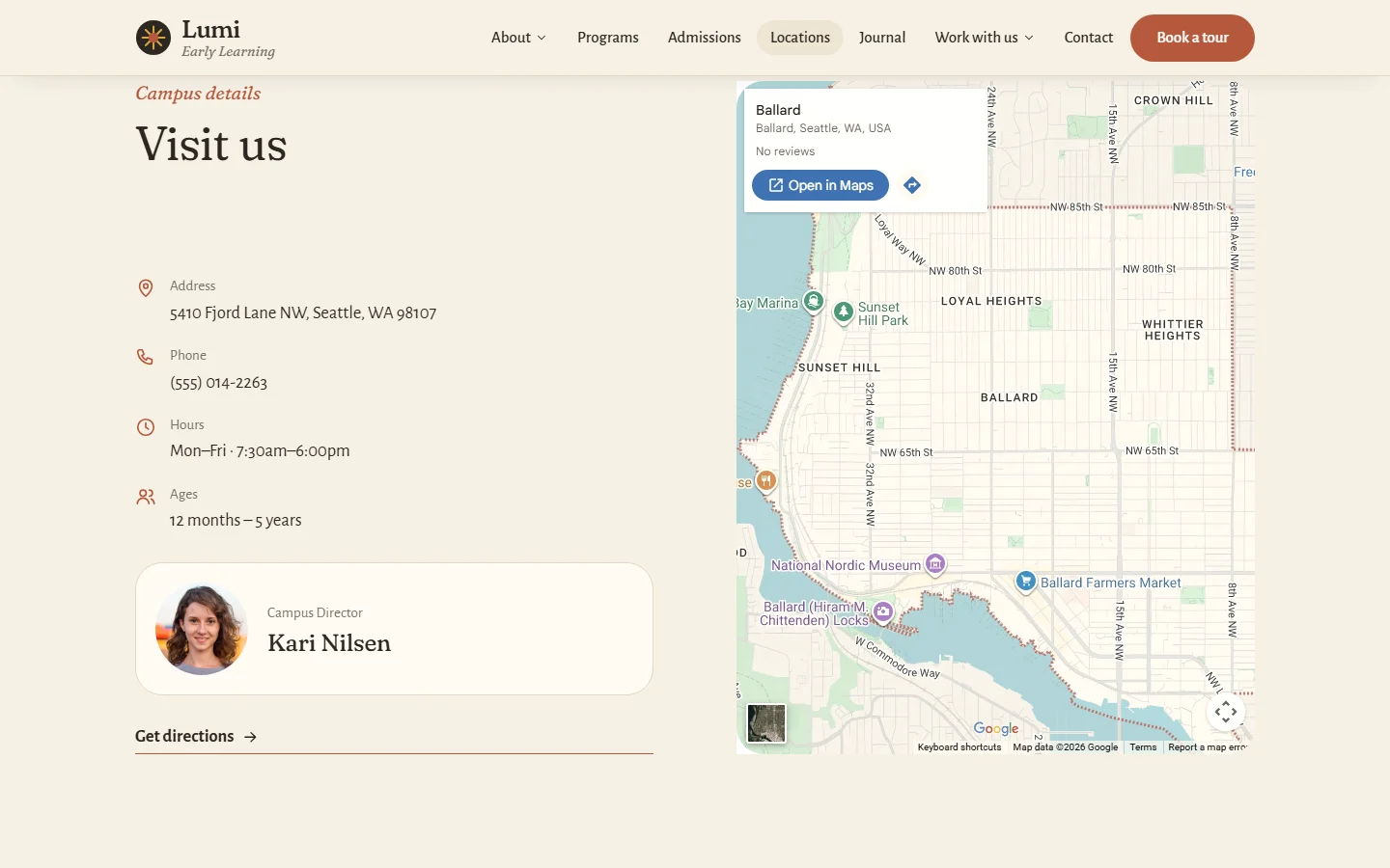
Locations. A region-filterable directory leads to campus pages that work as local landing pages. Each has an address, hours, an embedded map, the campus director, neighborhood landmarks, an enquiry form pre-set to that campus and its own SEO title, a structure built for “early learning center near me” searches.
Journal. Article templates with reading time, pull quotes and related posts give Lumi a home for education website marketing and education content strategy: seasonal, practical advice about play based learning and outdoor preschool curriculum that reaches parents through search long before they’re ready to enroll. See how we approach content strategy.
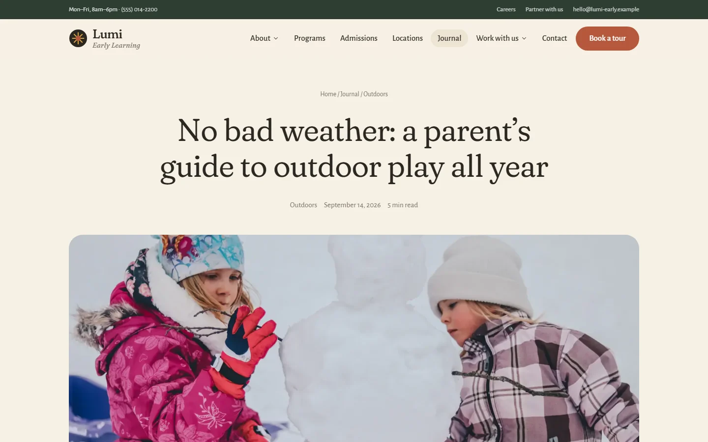
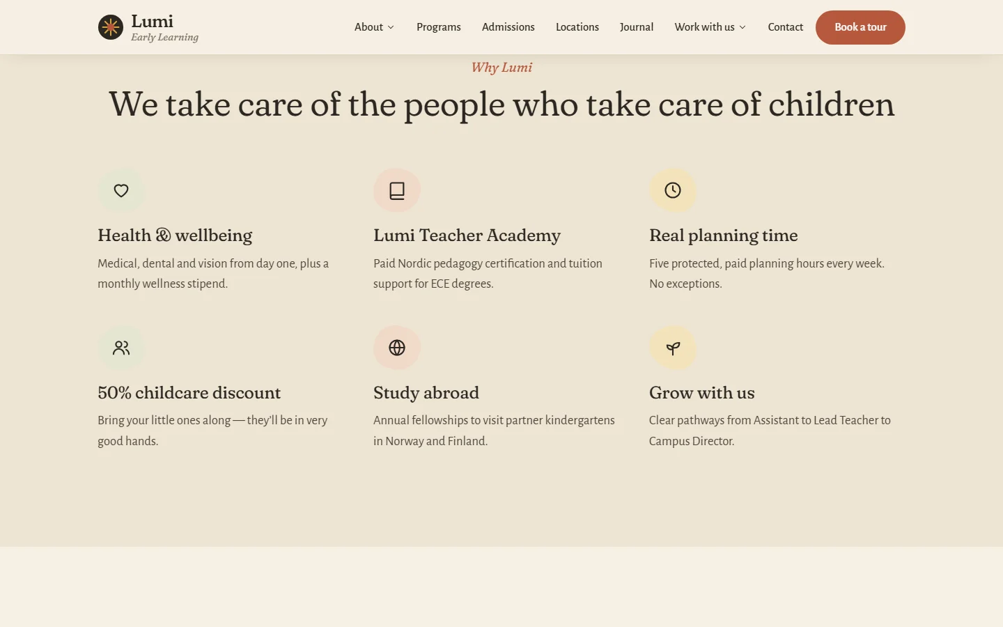
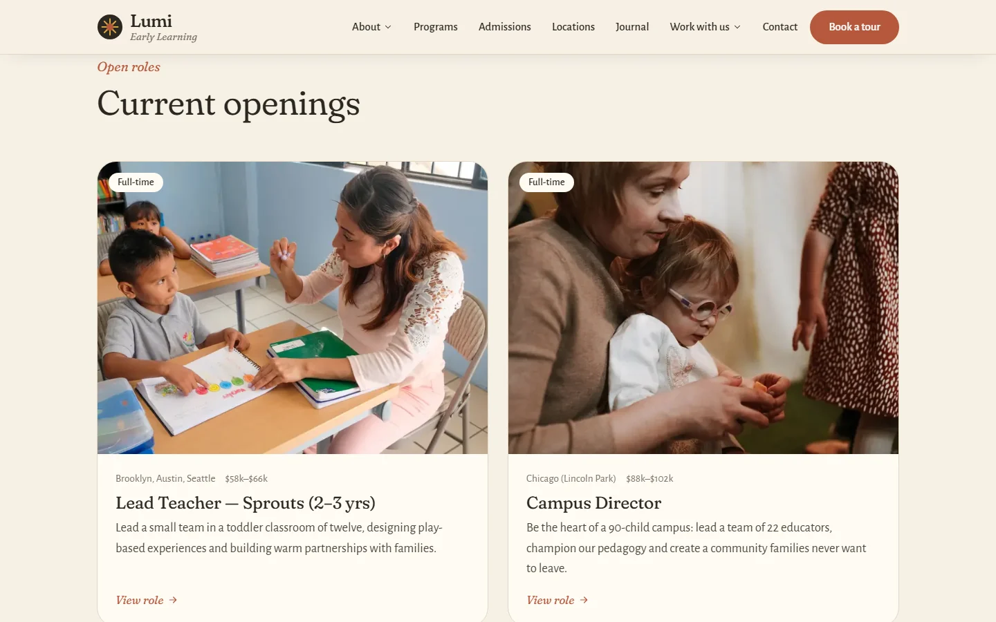
Careers and partner program. Dedicated recruitment pages and job templates support hiring, and a partner page opens a preschool franchise-style growth channel for new campuses.
Mobile-first, because parents browse one-handed
Most preschool research happens on a phone, often with a toddler on one hip. Every template was designed at 390 px first:
- A full-screen menu with expandable sections and the tour button always in reach
- Single-column forms with large touch targets and native date pickers
- Swipeable testimonials and image galleries that reflow into tidy two-column grids
These patterns carry straight into mobile app UI/UX design services, so a future parent app could share the same visual language.
Development: learning website development that’s lightweight, accessible and SEO-ready
We hand-built the site as static HTML from a small, dependency-free generator, so it stays lightweight, secure and cheap to host anywhere. It’s web development for education without bloated themes or plugin sprawl.
- Weight. The whole site, including every photograph, is 3.6 MB. All the JavaScript combined is about 3 KB, with no frameworks or dependencies.
- Images. Responsive WebP at two sizes, lazy-loaded below the fold, with the hero prioritized for Largest Contentful Paint.
- Accessibility. Semantic landmarks, labeled form fields, visible focus states, a skip link and respect for reduced-motion preferences.
- Search. Unique titles and meta descriptions per page, clean URLs, breadcrumbs,
hreflangtags and crawlable campus pages, the foundations our edtech SEO services build on. - Checks. 1,230 internal links and asset references verified, with none broken.
Our Lighthouse run scored Performance 80, Accessibility 90, Best Practices 100 and SEO 82. We published the numbers as measured and haven’t tuned them for the screenshot. Content changes go into a single structured file, and the site rebuilds in under a second.

Built to go global: multi-locale from day one
Lumi’s growth plan includes new countries. Each locale lives in its own content file covering copy, campuses, currency and contact details, plus a small set of design tokens. A UK or UAE edition can use a different accent color, typeface or corner radius and local imagery, while sharing the same tested templates. The footer region switcher and hreflang tags update with each new market.

Beyond preschool
The system isn’t limited to early years. The same principles apply to e-learning web design and online learning web design, K-12 and school website redesign projects, and higher education website design: research-led architecture, a human brand voice, conversion-focused admissions journeys and a lean build. See our work in the education and edtech industry.
What we delivered
- A UX audit and a template strategy that cut 16 audited templates to 13
- An information architecture built around the parent journey
- A brand identity: mark, palette, typography and handmade details
- A component-based design system and 29 pages across 13 templates
- A lightweight, accessible, multi-locale static front end, delivered as part of our web design service
Planning a new education website?
Whether you run a preschool network, a school or an online learning platform, we’d love to help you design something families and learners trust. Talk to us about education website design, an edtech UX audit with our UX audit service, or work with an education website design company that designs and builds.
FAQ
Is Lumi Early Learning a real preschool?
No. Lumi is a self-initiated concept we created for this project. The campuses, programs, tuition and testimonials are sample content.
How long does an education website design project take?
It depends on content readiness, the number of templates and the number of locations. A project like Lumi, with a UX audit, brand identity, design system and development across 13 templates, is scoped after a conversation about those.
What makes a good preschool or early learning center website?
Warm, authentic photography, clear programs by age, transparent tuition, an easy way to book a tour and a dedicated page for each campus. Mobile performance matters most, because parents research on their phones.
Do you offer education website development as well as design?
Yes. We design and build. For Lumi we hand-coded a lightweight static site.
Can one website serve multiple countries or campuses?
Yes. We structure content so each locale or campus is data, not a separate site. That keeps branding consistent while allowing local language, currency and design changes.
Do you run UX audits for existing education or edtech websites?
Yes. An edtech UX audit like the one that shaped Lumi covers sitemap and template analysis, navigation, admissions conversion paths, accessibility and technical SEO, and ends with a prioritized action plan.