

Verso: hospitality website design for a guest experience platform
A concept guest experience platform for restaurants, hotels and nightlife. We designed and built its marketing website: 11 templates, an immersive hero, calm motion and a design system ready for new markets.
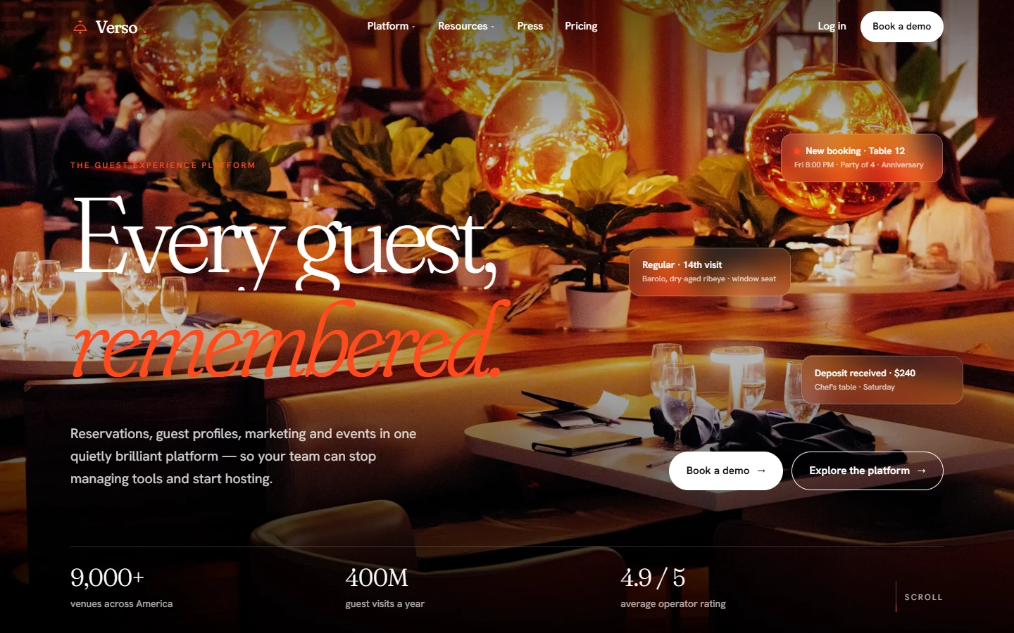
Verso is a concept guest experience platform that gives restaurants, hotels and nightlife venues one place for reservations, guest profiles, marketing and events. As a hospitality web design agency, we designed and built its marketing website from the ground up: an immersive, editorial site that feels like a great dining room and converts like a SaaS product.
Project facts
- Type — self-initiated concept. Verso, its venues, guests, prices and figures are sample content.
- Industry — hospitality technology (restaurants, hotels, nightlife)
- Services — brand direction, UX strategy, web design, design system, front-end development, motion design
- Scope — 11 page templates, US market launch, multi-locale ready
The brief: restaurant and hotel website design that feels like hospitality
Most restaurant reservation platforms market themselves with the same dashboard screenshots and blue gradients. Verso wanted the opposite: a site that operators would recognize as hospitality first and software second. It also had to be guest experience platform design that works as a restaurant website design agency or hotel website design agency would approach it: taste first, product second. The website had to do three jobs at once:
- Sell a complex product simply. It covers reservations, a hospitality CRM, email and SMS marketing for restaurants, and private event management, all in one story.
- Earn trust with demanding buyers. Restaurant groups, hotel F&B directors and nightlife operators judge taste first, so the design had to feel at home next to the venues it serves, the standard luxury hospitality web design is held to.
- Scale across markets. The US launch comes first, and the UK, Australia and UAE can follow with only small changes to design and content.
Research and audit: a restaurant website UX audit
Before designing anything, we ran a restaurant website UX audit across leading guest experience platforms and hospitality SaaS sites, the kind of work a marketing agency for hospitality brands starts with. We mapped every page type they use and reduced them to ten core templates: product feature, campaign landing page, demo request, success story, gated guide, webinar, press release, research report, legal, and seasonal content hub. What we found:
- Navigation was crowded. Dropdowns ran to 20+ links with no hierarchy.
- Product pages read like spec sheets, with very little imagery of real service.
- Conversion paths were inconsistent. Every page asked for a demo in a different way.
- Most mobile menus were shrunken desktop menus, not designed for thumbs.
See our UX audit service for how we run these.
Brand direction: hospitality first, software second
We gave Verso a confident black-and-white identity with a single vermilion accent (#ff4a1c). The palette borrows from restaurant menus and hotel signage: high contrast, quiet confidence, one color that means “act here”.
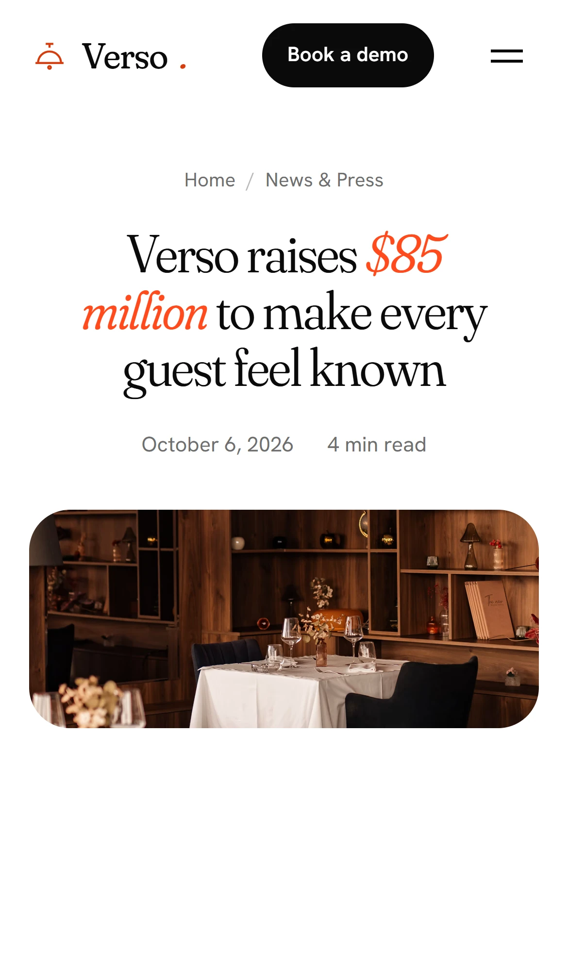
Typography avoids the rigid, geometric sans-serifs common in SaaS. Headlines are set in Fraunces, a soft, high-contrast editorial serif, with italic accent words that read like a maître d’s handwriting on a reservation card: “Every guest, remembered.” Body copy uses a warm humanist grotesk for comfortable long-form reading.
Photography shows real service moments: candlelit dining rooms, chefs plating, bartenders mid-pour. It does not use stock shots of laptops. Every image answers the same question: what does a better guest experience look like?
Our branding work set the direction before a single template was designed.
An immersive homepage hero
The homepage opens on a full-screen dining room in the middle of service. The photo starts dark and zooms out slowly, like house lights coming up. The headline then rises into view one line at a time.
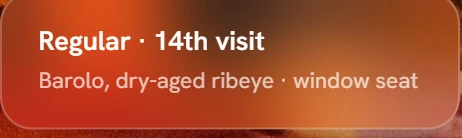
Floating over the scene are frosted-glass notification cards of the kind a host stand sees on a Friday night: New booking · Table 12, Regular · 14th visit, Deposit received · $240. They drift gently and shift with the mouse, which gives the hero depth without a single line of 3D code. In ten seconds they explain what the product does better than a paragraph could.
As you scroll, the photo moves more slowly than the page. The header starts transparent over the photo and switches to solid white once you leave the hero.
Motion that feels like service
Every section reveals itself as you scroll: content fades up, card grids arrive one after another, and photos settle from a slight zoom. Stats count up as they enter view, and research charts fill from left to right. The motion is quick and calm, the way good service should be: present, never in the way. All animation respects the visitor’s reduced-motion setting and uses no animation libraries. Each page loads one stylesheet and two small scripts.
Navigation UX for a multi-product platform
We cut the navigation down to four items: Platform, Resources, Press and Pricing. Every dropdown entry gets a one-line description, so visitors choose by outcome (“Turn first visits into regulars”) rather than by product name. It is dropdown UX design that reduces decisions instead of adding them, with navigation UX design that scales as the platform grows.
On mobile, the menu becomes a full-screen panel with large serif links that are easy to tap, designed from scratch for mobile menu UX rather than squeezed down from desktop.
Restaurant reservation system design, told visually
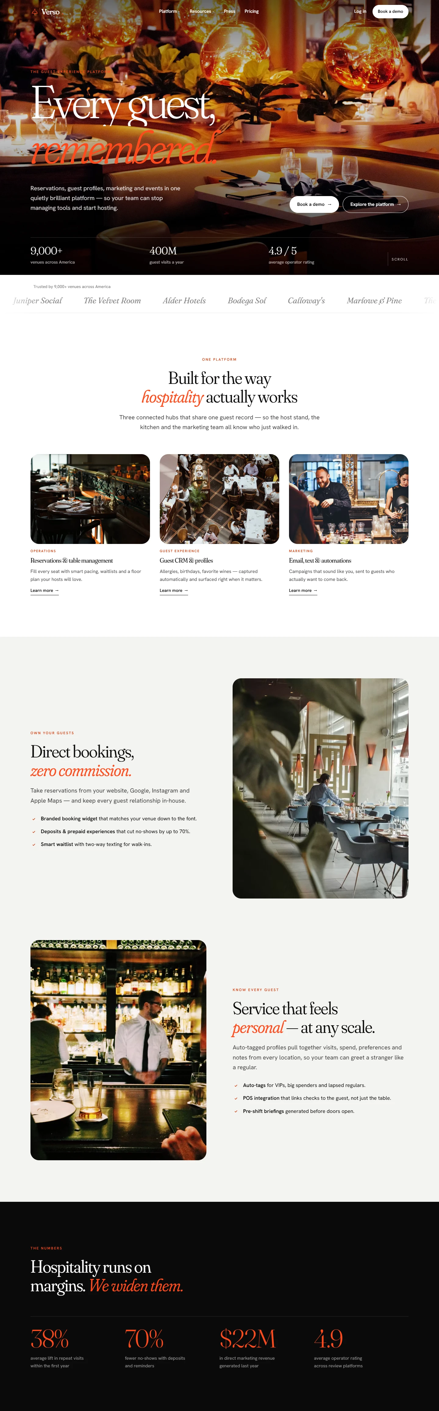
Rather than screenshots of dashboards, Verso’s restaurant reservation system design story is told through service moments. Alternating image-and-text sections pair each feature with the scene it improves:
- Direct bookings, zero commission. A branded booking widget shown next to a guest at their table, positioned against third-party restaurant reservation platforms.
- Know every guest. The hospitality CRM UX story, told through a bartender preparing for a regular.
- Marketing on autopilot. Email marketing for restaurants and SMS for restaurants, backed by open-rate and revenue stats.
Events and private dining product page
The events page follows a clear selling sequence: an outcome-led hero, four numbered feature chapters (Revenue, Conversion, Lead capture, Operations), a testimonial slot with key stats, a grid of the eight connected products, and an FAQ accordion that answers the questions buyers ask before they book a demo.

Conversion paths: hotel booking conversion optimization for hospitality buyers
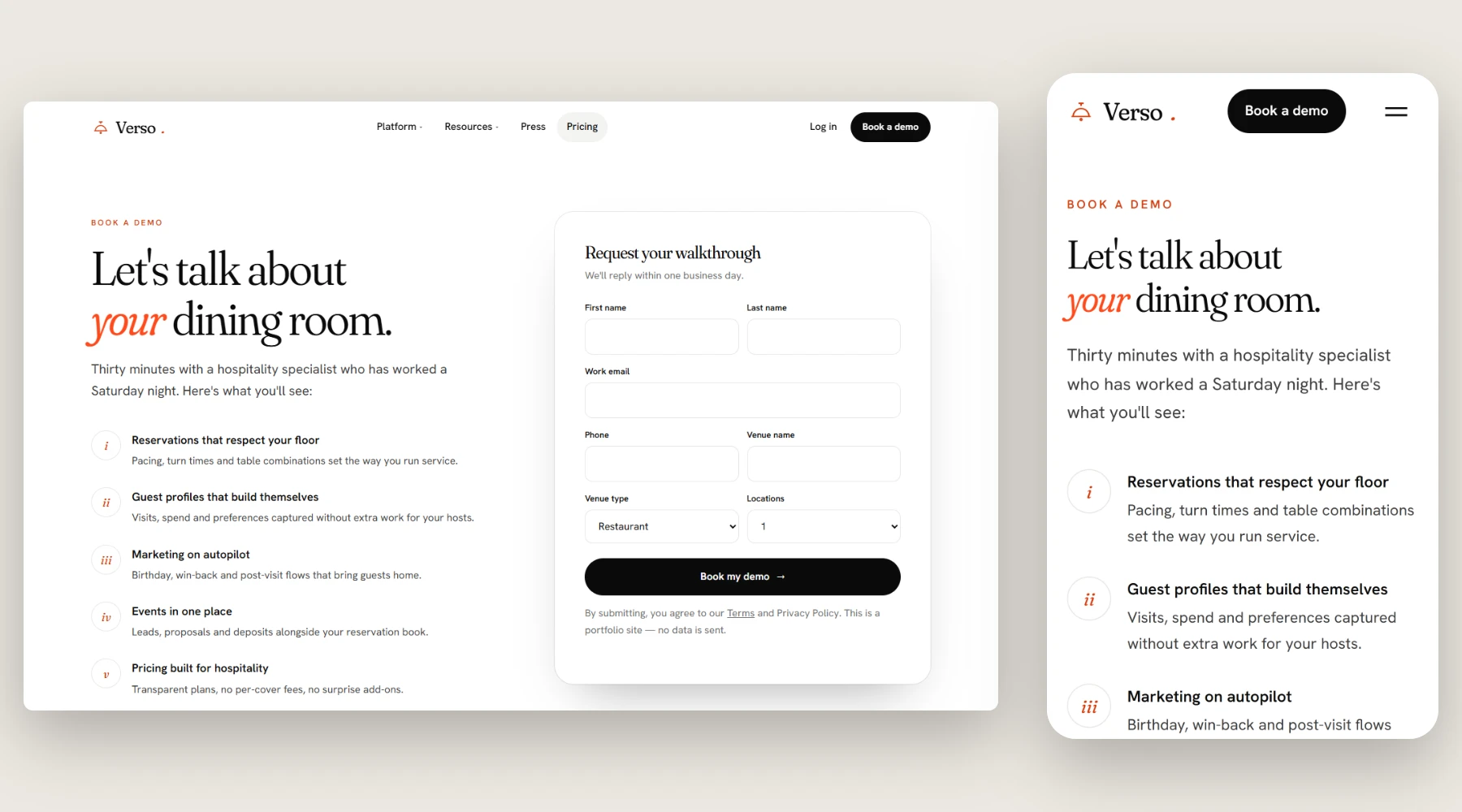
Every template ends in the same journey: book a demo. The demo page drops visual noise for a single focused form, sitting next to five plain-language reasons to book. The fields are designed for venues (venue type, number of locations) rather than generic B2B fields, an approach taken from hotel booking conversion optimization.
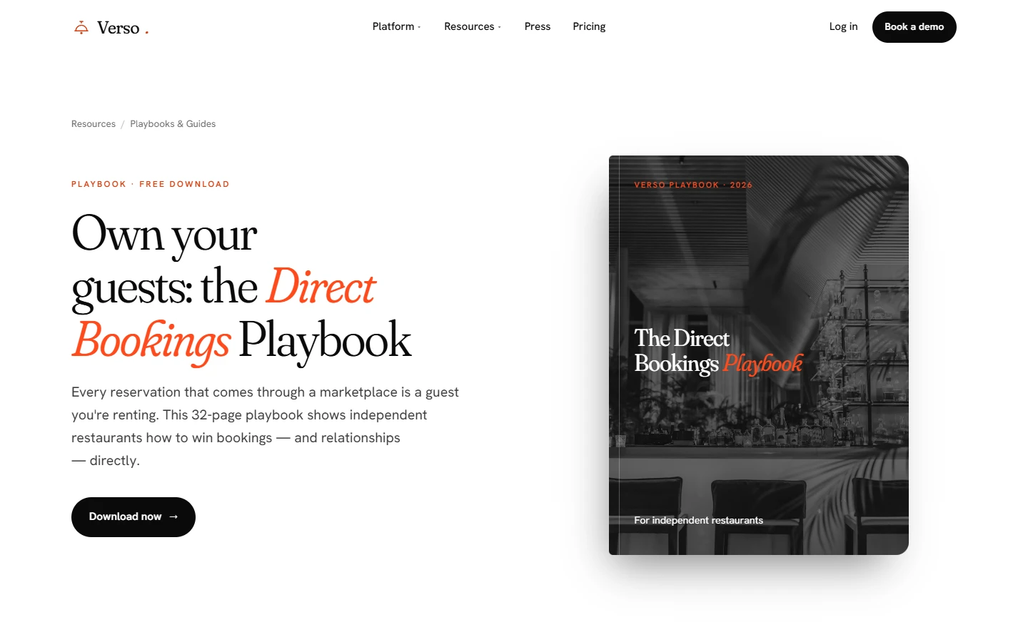
Lead magnets carry the same thinking: the gated playbook appears as a tilted book cover beside a short form, and webinars lead with a large play button and speaker cards.
A content engine for hospitality marketing
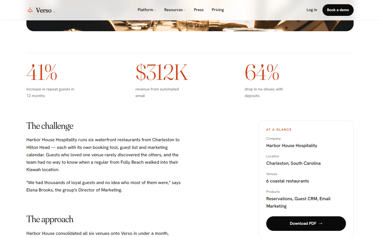
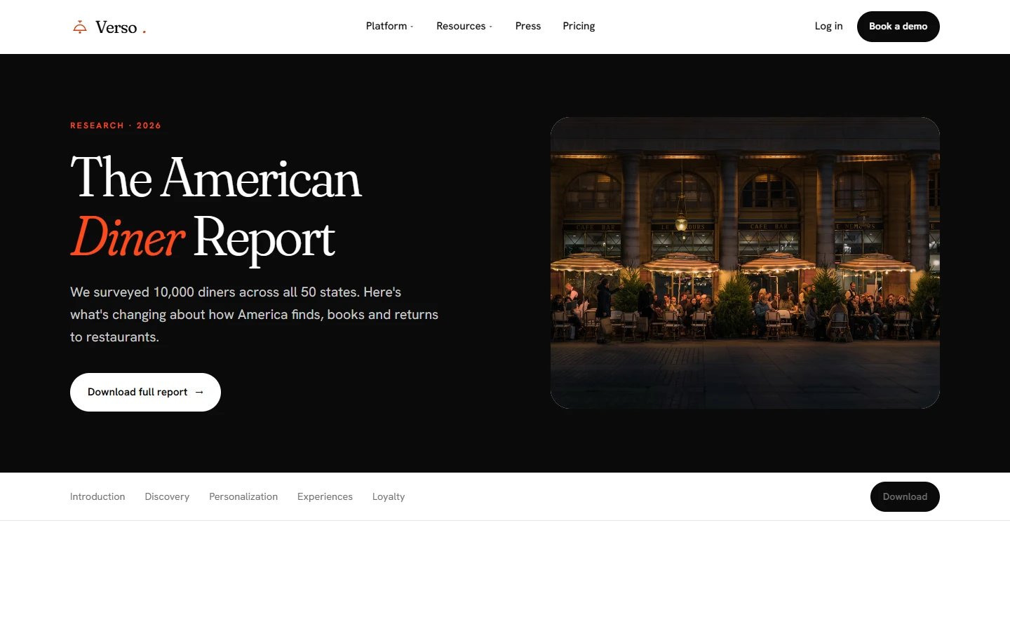
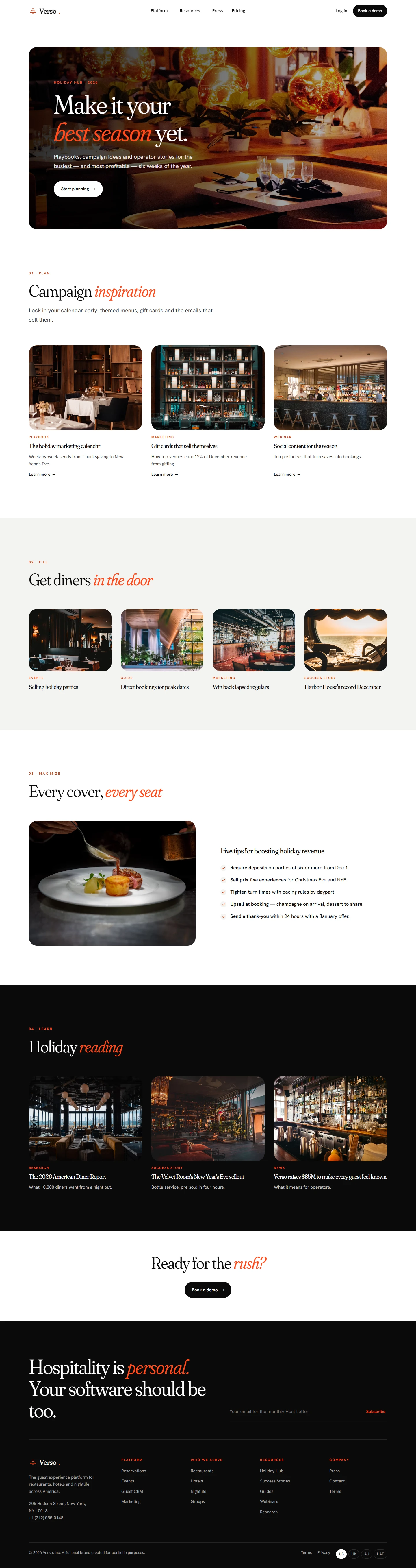
Verso’s growth depends on content, so the website includes a full publishing system: success stories with an “at a glance” sidebar, a press-release template, an on-demand webinar page, a chaptered research report, and a seasonal Holiday Hub that brings together guides, stories and webinars. These templates give Verso’s marketing team the tools of a restaurant marketing agency inside its own website, built to rank for long-tail hospitality topics all year. See our SEO and content strategy work.
A hospitality design system UI that scales across markets
Everything is built on one hospitality design system UI: shared color, type, spacing and motion tokens, plus reusable components (cards, tiles, stats, quotes, image bands, forms, accordions). Our design systems service follows the same approach.
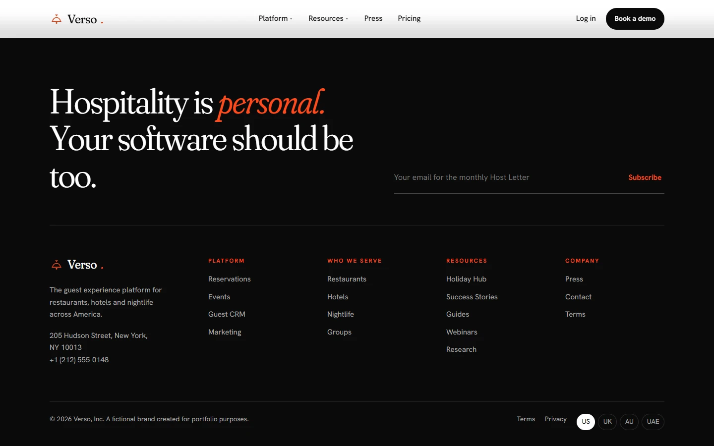
Navigation, footer, contact details and market-specific text live in a single locale file. Launching the UK, Australia or UAE site means copying the pages, swapping that one file and, where needed, adjusting the palette in one place. Each market gets the same polish without the cost of a rebuild, which makes the system a ready foundation for white label booking engine UI and partner pages.
Built for speed and search
- A static, framework-free build: one CSS file and two small scripts
- Images resized per placement and lazy-loaded below the first screen, with the hero image prioritized
- Semantic HTML, a “skip to content” link, visible focus states and reduced-motion support
- A unique title, meta description and a single H1 on every template
- Font and image domains connected early (preconnect) so text and photos appear sooner
Outcome
Verso has a website that looks and feels like hospitality while carrying the full depth of a multi-product venue guest experience software platform. It has eleven page templates, an immersive first impression, calm and purposeful motion, and a design system ready for new markets.
Planning a restaurant or hotel website?
We design restaurant and hotel websites that sell the experience before the booking. Talk to our hospitality web design agency about web design, branding or a restaurant website UX audit, or see more work in the hospitality industry.
FAQ
Is Verso a real company?
No. Verso is a self-initiated concept we created for this project. The venues, guests, prices and figures are sample content.
What does a hospitality web design agency do?
A hospitality web design agency designs and builds websites for restaurants, hotels, bars and hospitality technology brands. It combines brand storytelling, booking and reservation UX, and conversion design to turn visitors into guests or customers.
How is restaurant website design different from regular web design?
Restaurant website design has to sell an experience before it sells a product. That means atmospheric photography, fast mobile performance, clear reservation paths and content that reflects the venue's personality.
Do you design restaurant reservation systems and booking engine interfaces?
Yes. We design restaurant reservation system flows, white label booking engine UI and hospitality CRM dashboards, from guest-facing booking widgets to host-stand tools.
Can one website design work across multiple countries?
Yes. Building on a shared design system with a separate locale file lets one design launch in new markets with tailored content, currency and legal details, without a full redesign.
How do you improve hotel and restaurant booking conversion?
We start with a website UX audit, simplify navigation, reduce form friction and give every page one clear call to action, backed by social proof and fast load times.